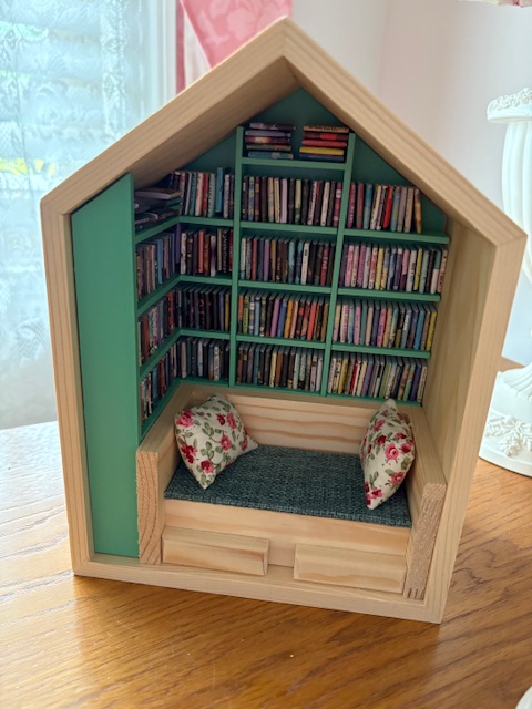
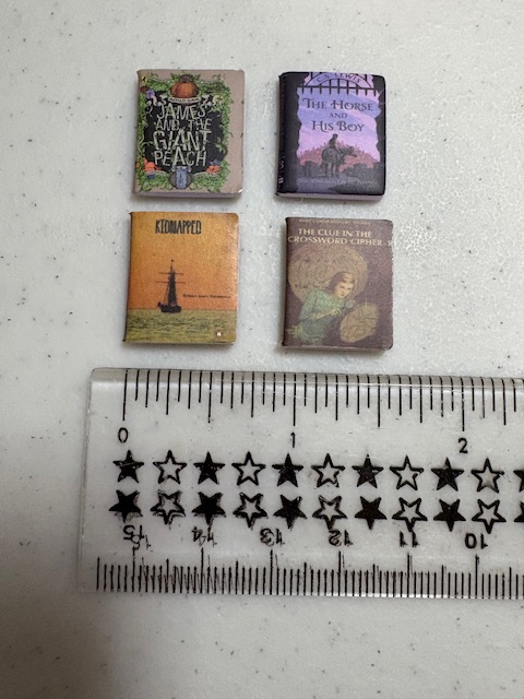
One of my Christmas presents from Jesse last year was this cute little mini reading nook.
It didn’t need painting or putting together–that was already done. Although I suppose I could paint the wooden parts. But for now I’ll leave well enough alone. The only thing I had to do was put these tiny books on the shelf. Here’s an idea of how small they are.
They do have covers of real books, but there are no individual pages.
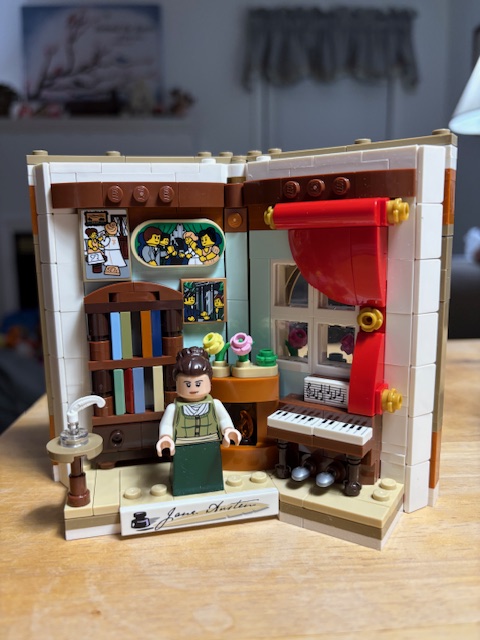
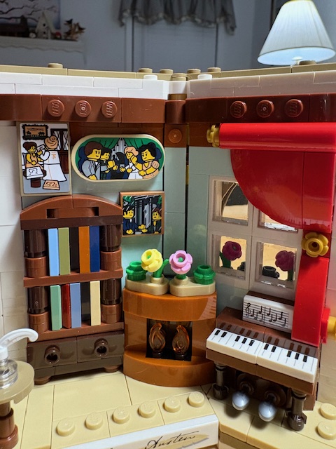
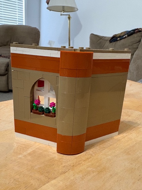
Another Christmas present, this one from Jim, was a Lego floral kit. I don’t know why, but I just really don’t like the floral ones. So I asked if we could exchange it for a Jane Austen-themed one. He was happy to make the exchange.
However, I hadn’t found time to put it together until now.
If Jim and I aren’t watching TV together in the evenings, I usually read from the Kindle app on my iPad mini. But if we are watching something, I usually use the coloring app on my iPad while we watch. I’ve been thinking for a while that perhaps I could work on this Lego kit at that time instead. I finally did that this week and completed it in a couple of evenings. Here’s the finished product:
I love the details–the bookcase, fireplace, piano, ink stand, and flowers seen through the window. I don’t like the “portraits” quite as much, but, oh well.
The back is supposed to look like a book.
I had fun putting it together and love how it came out.
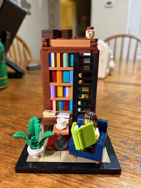
Some of you may remember a previous bookish Lego kit I completed last year.
Right now this one is on my desk. There’s not really room for the new one on my desk, so I am trying to decide whether to put it on a bookshelf in the living room or guest room and whether to move this one near the new one or not.
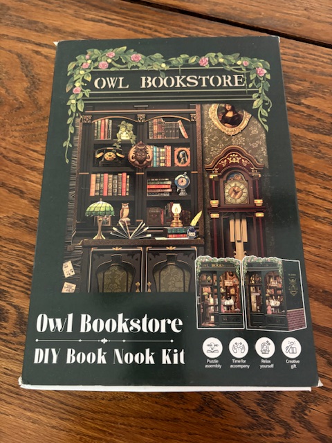
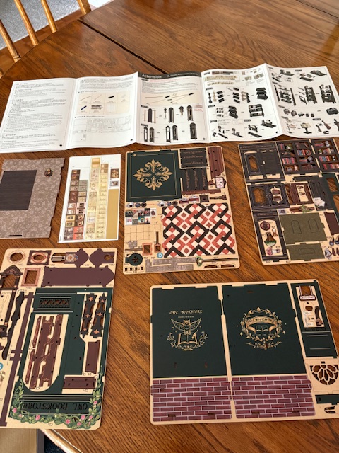
I got this kit two Christmases ago.
It’s not Lego. It seems to be made out of kind of a heavy cardboard. I opened up the instructions and pieces . . .
. . . and promptly closed them back up again. 🙂 This one looks complicated. I may try to lure Jesse (my youngest son) over with dinner one night and see if he’ll help me at least get started on it. He’s always been good with technical instructions–he’s navigated them while helping his dad and brother put things together. Plus he likes to build Metal Earth kits.
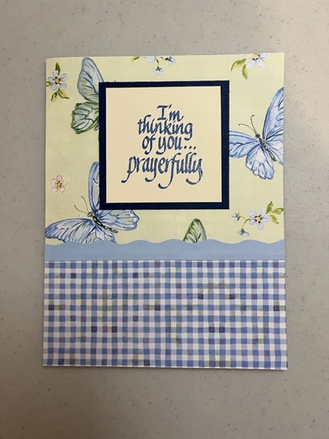
I enjoy making cards as a hobby. It began when I shopped for cards one year and found most of them were $5.99 and up. I had a lot of craft supplies on hand and decided to try making cards.
You may have seen a meme which says something like why spend $6 on a card when you can spend $72.95 on craft supplies to make cards. 🙂 One can easily get carried away, as there are so many tools and materials with which to make cards these days. But some of the nicest cards are the most simple.
This isn’t a craft blog, but as I discussed these things with a friend recently, I thought some of you might be interested as well.
I confess I have an embarrassment of riches when it comes to craft supplies. My family often gets me either craft things or gift cards to Hobby Lobby. I can’t receive some of the “usual” gifts for moms. Scented things give me a headache, so candles, perfumes, lotions, soaps, etc, are out. I prefer to buy my own clothes. I enjoy inexpensive jewelry, but have more than I can use as it is. I used to ask for books, but most of my books are ebooks now. So craft supplies and gift cards are my main gifts.
Hobby Lobby frequently has some of their papercrafting supplies on sale for 40% off, so I make the most of my gift cards then.
My husband bought me a Cricut machine some years ago, which plugs into the computer and accesses their Design Space. You can look up specific projects or search for images. When you find what you want, the machine will divide the image up into different layers, which you can then set it to cut. The Cricut is a marvel, and I still don’t know a lot of what it can do. But it is also expensive. I almost feel guilty for having one, or feel I should have an Etsy shop or something to justify my having a Cricut. But I thankfully accept it from my husband’s generosity.
However, I want to encourage you that you can make nice cards without a machine or hoards of supplies.
Getting ideas
I have a Pinterest board for homemade cards, divided into categories. Some of the pins take you to the site of the person who made the card with their instructions. However, most don’t contain instructions. I try not to copy an idea exactly if the person who made it is trying to sell it. But I might let the idea inspire me.
I take the interests of the recipient in mind. For instance, my daughter-in-law likes sunflowers, daisies, and the color purple. My oldest son likes foxes and has a cat. My husband is handy and like camping and fishing. My youngest son is into gaming and technology. So I’ll try to find or come up with an idea incorporating their interests.
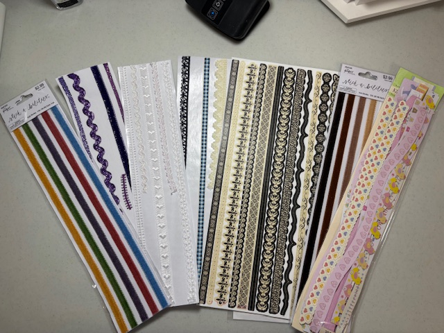
I also look through my decorative papers, trims, and stickers, and sometimes an idea will evolve.
Tools
I’m blessed with a lot of tools accumulated through the years, but nice cards can be made with the barest supplies.
I usually use scrapbooking paper as a background, but that’s not always necessary. Hobby Lobby and Michael’s both sell individual sheets of decorative paper as well as pads of themed paper. I’ve gotten some pads of decorative paper on Amazon as well.
Decorative scissors provide an interesting edging.
Lace, ribbons, paper scraps, or store-bought trims add special touches and sometimes provide a cover for overlapping papers. Most of these trims are adhesive, which helps a lot.
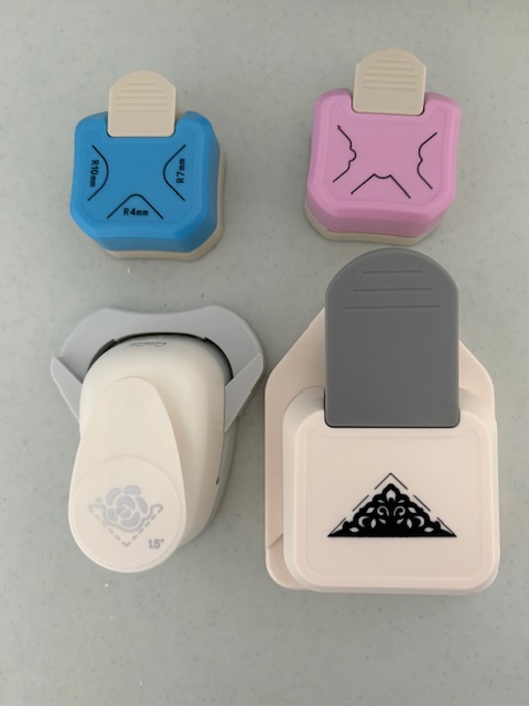
Punches can be expensive. When I haven’t had just the right size, I’ve used stencils instead. I’m not good at cutting things out on a line, so they edges aren’t as sharp as with a punch. But they’ll do. Sometimes a wobbly edge can be covered up with trim or a sticker.
Some of my favorite punches are corner cutters.
You don’t have to have wording on the front of a card. I do on most of mine. Since my writing is not the best, I usually use the computer for whatever I want the front to say, print it, then use the paper cutter, punches, or stencils to cut it out. But I have also used stamps and stickers. I have some lettering resources to try to teach myself to write clearly enough for the front of a card, but haven’t had time to delve into them yet.
I just use a basic craft glue stick most of the time. My oldest son got me a sticker-maker, which I usually use for the inside sentiments. The glue it uses is really strong with little hope of repositioning. But the basic glue stick can be moved around a little before it dries.
Sample cards
All of these have appeared on the blog before.
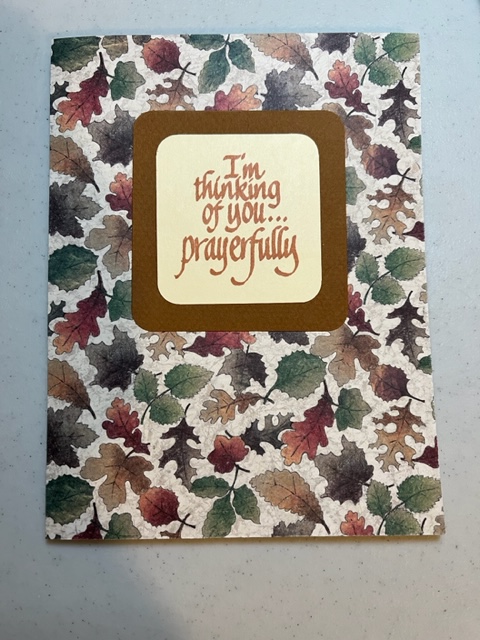
One of the simplest card ideas has a decorative background of scrapbooking paper and a simple saying surrounded by a contrasting or solid color:
The words here were done with a stamp. The corners of both the saying and the paper around it were rounded with a corner cutter.
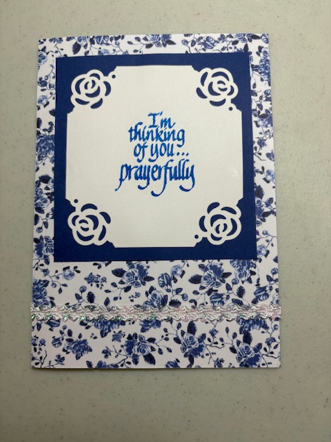
This card takes the decoration one step further:
The roses on the corners of the saying were done with a decorative punch. I added a piece of lacy sticker trim across the bottom.
You could also use coordinating papers on a card, and cover the overlap with a bit of trim.
The trim above was made with colored paper and decorative scissors.
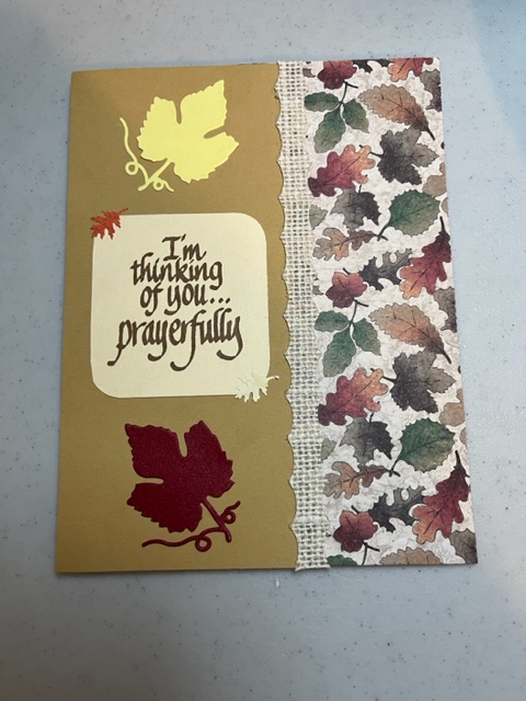
This one takes things a step further:
The burlap trim is another sticker. The two leaves were cut out with another device, a Cuttlebug. But there are also leaf punches or stencils one could use. If I remember correctly, the small leaf stickers were used to cover up a mistake on the corners.
And this takes the same basic idea even further:
The cards above and below use two punches of different sizes, which could also be done with stencils:
You could also use simple shapes. I think I used the Cricut for the monitor here, but it could easily be done without it:
I found a font online that looked like computer typing and used it here.
I think I did these mugs with the Cricut as well, but they would be simple enough to draw.
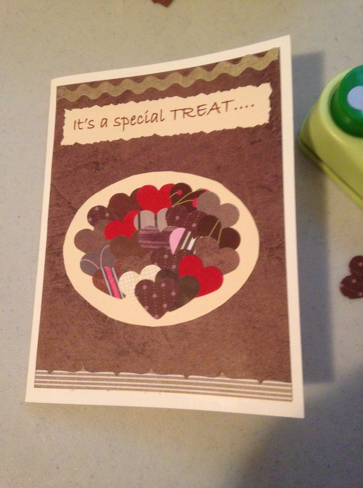
This is one of my favorites, from an idea on Pinterest.
I used a heart punch on various papers to make what I hoped looked like a plate of Valentine candy. Decorative sticker trim is at the top and bottom.
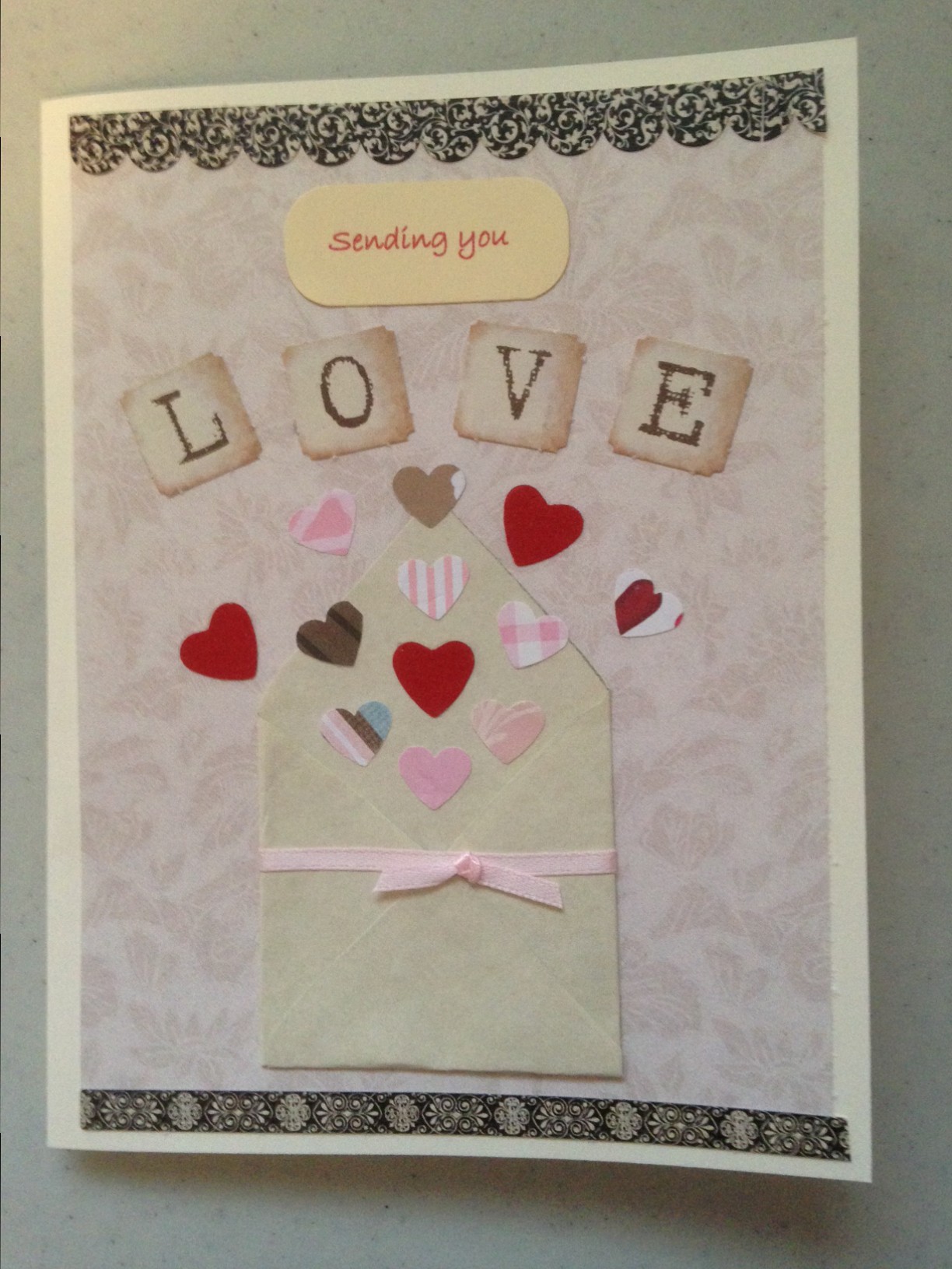
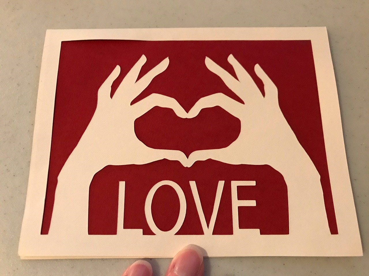
This was another made with heart punches. The letters for “LOVE” came from a package of scrapbooking paper which had a couple of pages of letters.
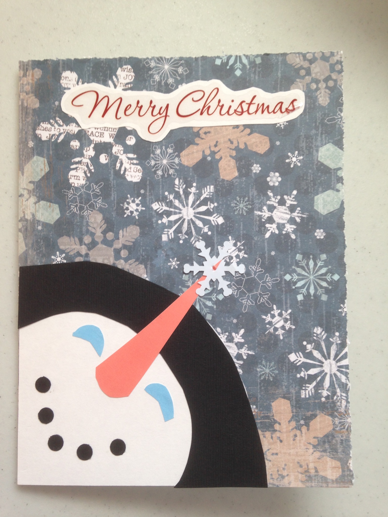
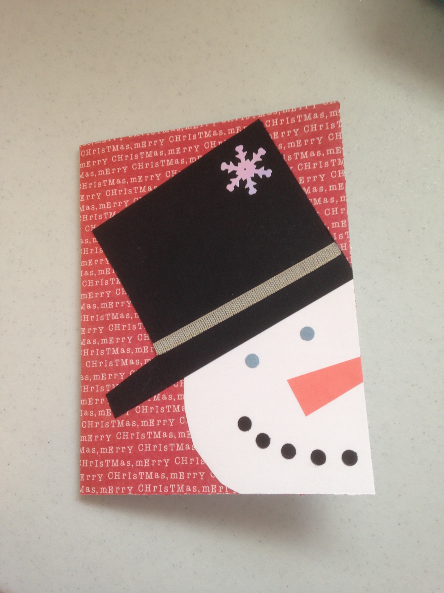
This is another Pinterest inspiration. I think I did it all freehand except the snowflake. And the dots for the mouth were probably from a punch. “Merry Christmas” was a sticker put on cardstock, then trimmed following the shape of the letters.
This one was made with two different kinds of paper for the background and stickers for the side graphics. The “scarf” was made from scrapbooking paper. The snowflake on the hat was from a package plastic snowflakes.
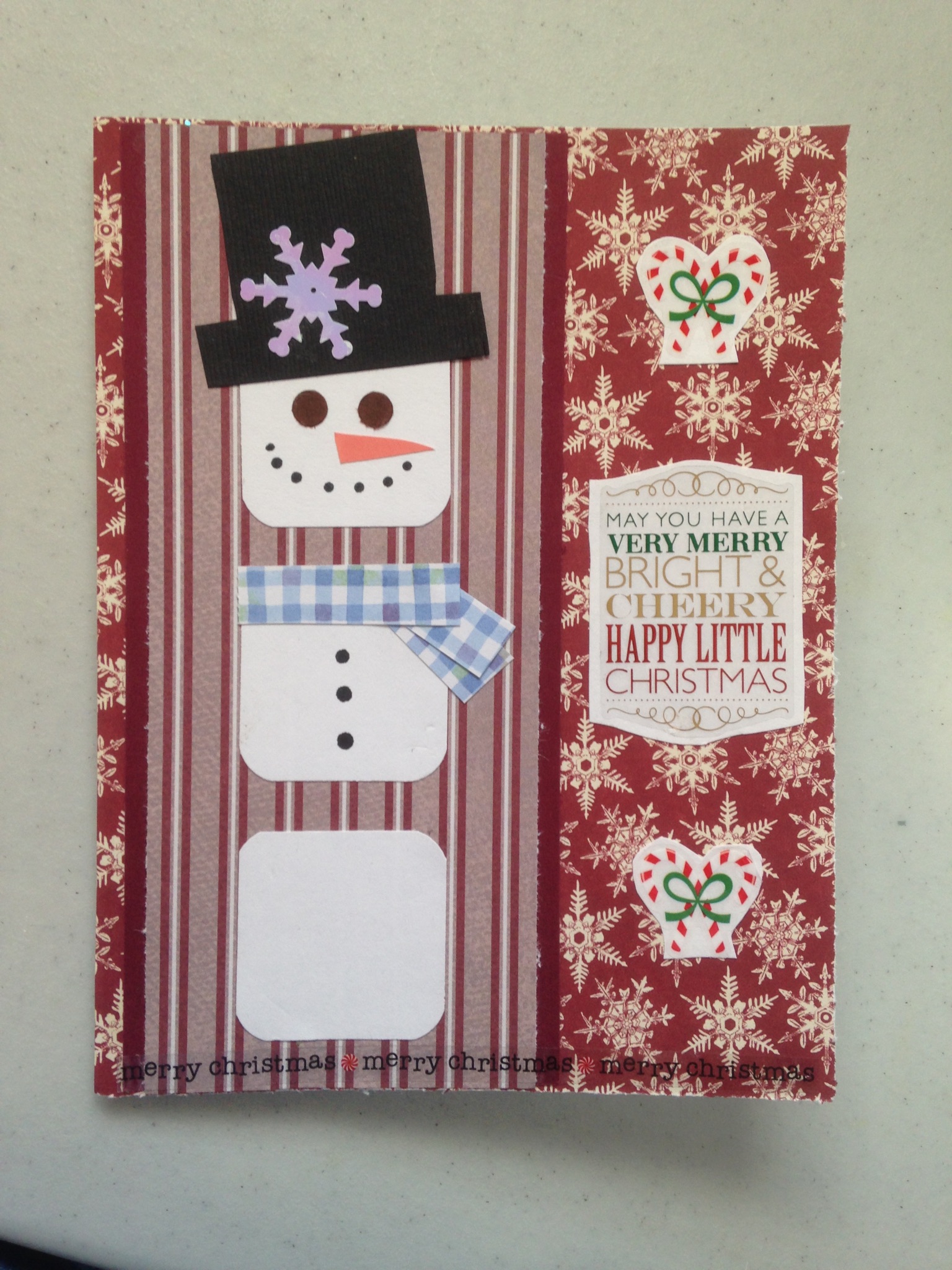
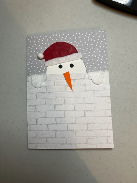
Another freehand idea from Pinterest.
The “wall” and sky here were scrapbooking paper, and the snowman was freehand. The hat came from a package of felt stickers.
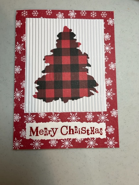
The white square here is from a corrugated scrapbooking paper:
The tree was done with the Cricut, but could easily be cut out by hand. The “Merry Christmas” was another sticker placed on white cardstock and cut with decorative scissors.
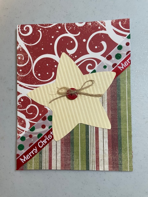
This Pinterest idea also uses corrugated paper, two different scrapbooking papers, ribbons, and a button with twine:
Tip: if you’re using lace, fabric, or ribbon that is not a sticker, it helps to dab the glue stick on the cut edges so they don’t fray.
The dress here was cut out freehand, and the “lace” is a sticker:
The flower came from a package of them.
Here is another one with simple shapes and a variety of papers:
This card just used scrapbooking paper, a Merry Christmas sticker, and puffy gingerbread people stickers. I added a felt Santa Christmas hat sticker.
You can find all kinds of little shapes at craft stores to use on cards. This little key was glued on scrapbooking paper, then I put decorative sticker trims around the edges.
There are even more tools, materials, and ideas for card-making out there. Cards can be very simple or elaborate, depending on your tastes and time.
I hope this inspires you to try making cards yourself.
I’ve written end-of-month posts this year, but I didn’t for December. There just wasn’t time, plus I figured most of us were doing the same things: getting ready for and then celebrating Christmas.
One thing I mention in those end-of-month posts is the books I read. Most of December’s reading was for the Literary Christmas challenge: one Christmas novel and three collections of Christmas stories or novellas. But I also finished up The Gilded Age by Mark Twain and Charles Dudley Warner and Shakespeare’s King Lear, both audiobooks, to complete the Back to the Classics Reading Challenge. Plus I finished the devotional book I had been reading all year, Seasons of the Heart.
At the end of the month I also share any cards I’ve made that month. December was a busy month for card-making.
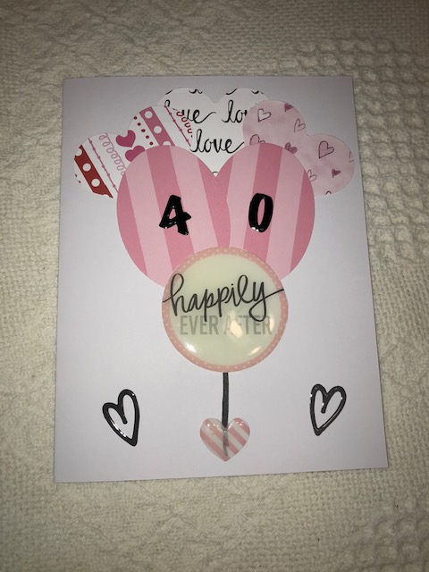
This one was for my husband for our 40th anniversary. It’s supposed to look like a bouquet of balloons. It didn’t come out quite as I had hoped, but my husband liked it.
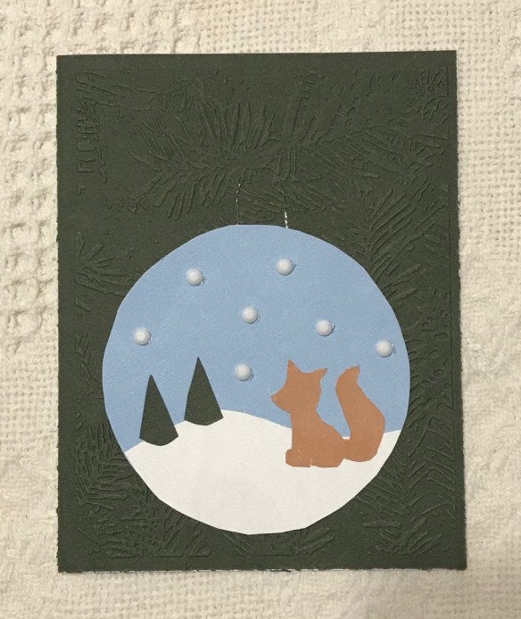
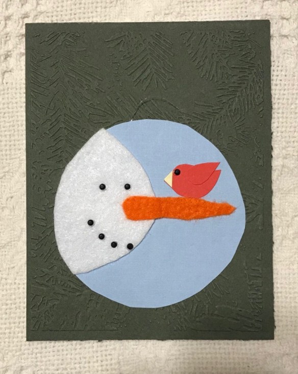
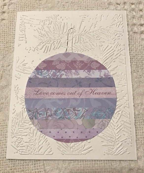
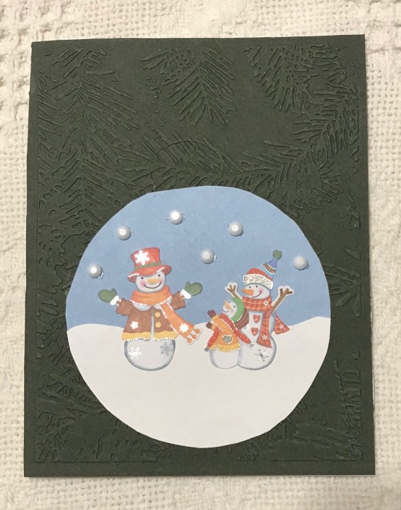
I buy Christmas cards to mail out, but I make cards for the immediate family. Only once before have I had a theme in making Christmas cards, and that was snow people. This year, as I looked at the design ideas I had accumulated on Pinterest, I saw several that looked like ornaments. So I decided to use that idea. I had a Cuttlebug embosser that looked like a fir tree, so I used that for all of the backgrounds.
The design I used for Jim’s and Jeremy’s came from a free pattern I used for felt ornaments for Timothy a few years ago. I just loved both of these designs and was glad to have a chance to use them again.
Jim’s:
I used this for Jeremy because he likes foxes, but this ended up looking more like a dog. I could not find a single rust-colored paper or card stock in Hobby Lobby or my own collection. I’ll have to stock up next fall.
I think Jason likes designs that are a little playful, so this one seemed perfect. I used stick-on felt for the snowman and card stock for the bird. The eyes and smile were stick-on beads.
Mittu likes purple, and one of their Christmas trees was white, so this seemed like a good combination for her. I cut strips from various pieces of scrapbooking paper and glued them side by side for the design.
The snow people on Timothy’s were made with stickers. I was delighted to find some that represented their family.
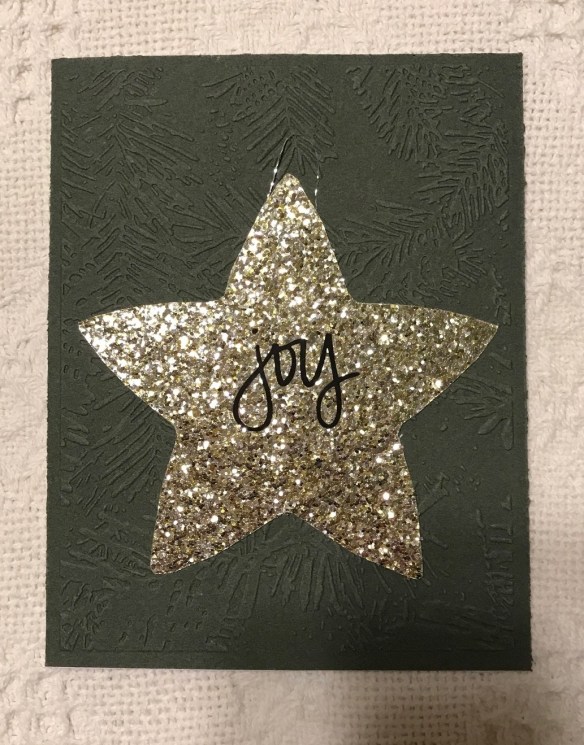
And this is Jesse’s, cut from a piece of glittery cardstock. The word is a sticker.
I had thought about coming back and adding a word at the top of each card, but there just wasn’t time.
Finally, this card was for my step-father’s after-Christmas birthday. The design was all done on the Cricut.
So that was my month in card-making! It was a busy one. But there are none to be made in January, so I’ll have a bit of a rest before February’s Valentine cards.
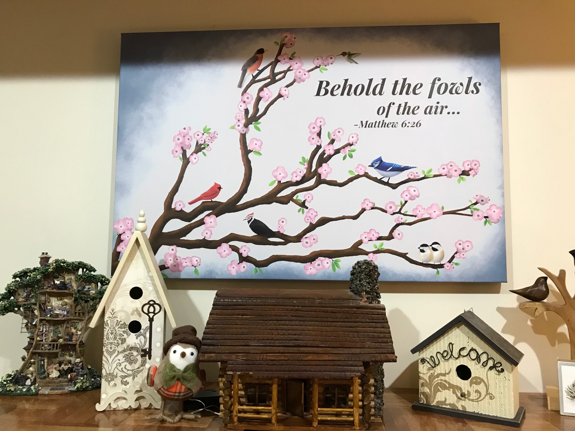
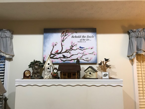
He used the iPad Procreate program to make the picture and then had it printed on canvas at Photobarn.
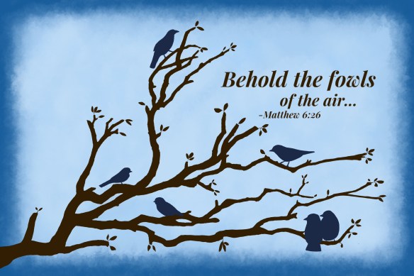
It all started with wanting something to fill that space. I had a very small plaque there on an existing nail, just for something, but it was way out of proportion to the area. I had collected some bird-related decorations, so I thought something with birds would be good. I started a Pinterest board called Nest and bird art. I liked several of the pieces there showing bird silhouettes on canvas or wood, so I thought I’d try to do something on canvas. I knew next to nothing about painting on canvas, but those designs looked pretty simple, and I figured I could look up what paints to use. But I just never got going on it.
Then one year Jason made his brother Jeremy this picture on the iPad and had it printed, because Jeremy likes foxes:
And I thought it was really good.
And I thought, “Hey! Maybe he could do my bird picture!” He’s talented in art even without the iPad program. And a bird silhouette should be simple, right?
Little did we know. 🙂
So I asked him, and showed him some samples of the kinds I particularly liked. The family room is in blues and tans with a bit of brown, my concession to the boys’ complaining when they were younger that everything was “too flowery.” (Those who know me well can imagine that. 🙂 ) So I knew I wanted those colors.
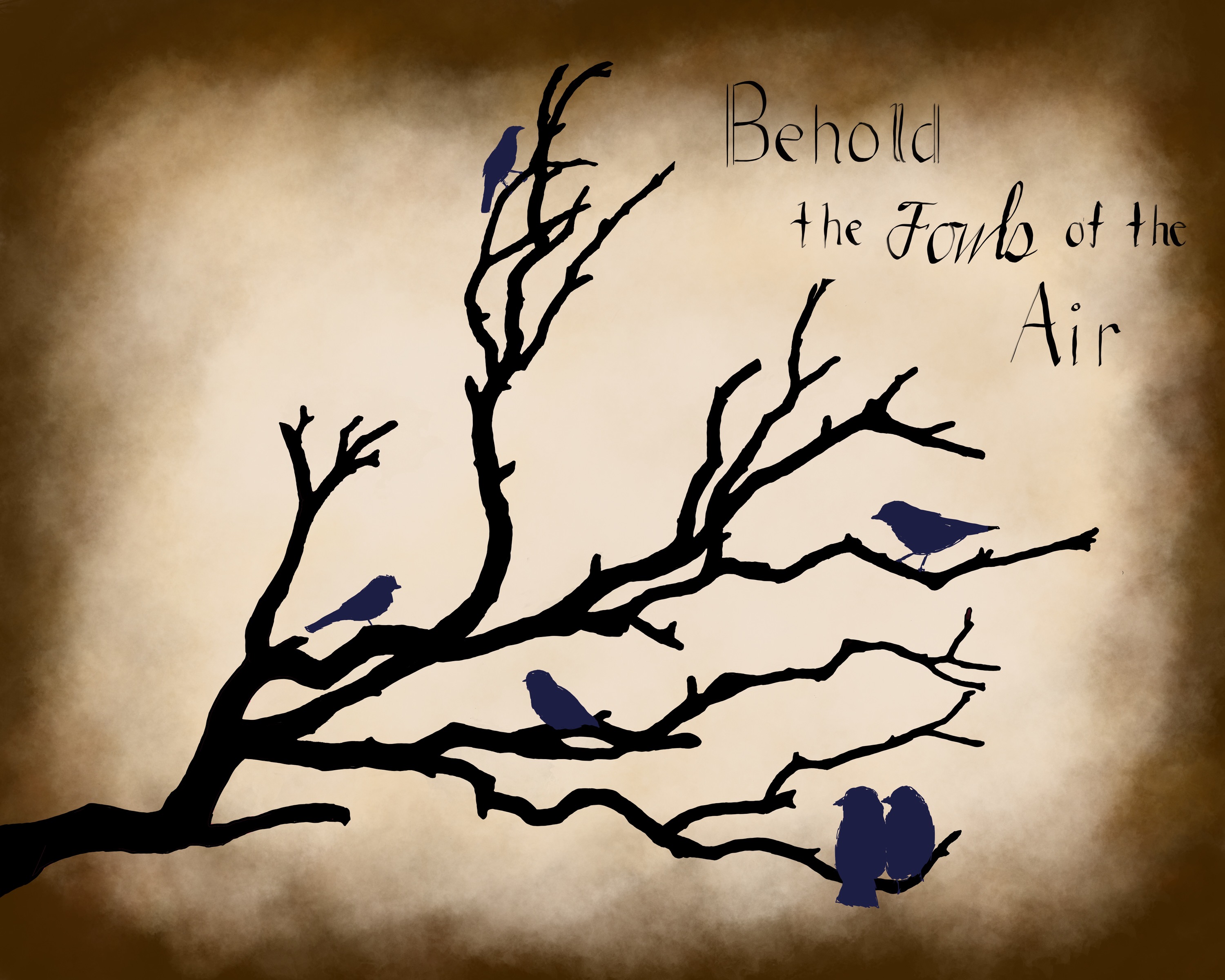
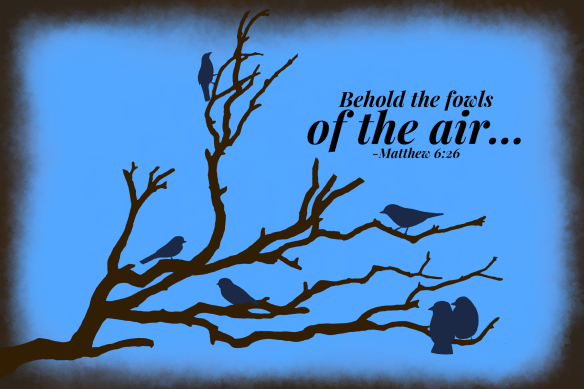
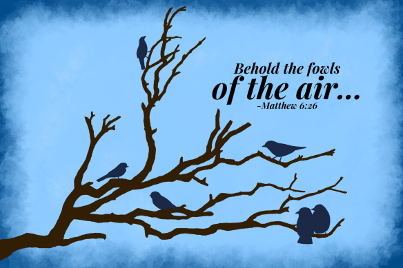
Jason emailed me his first draft:
We both agreed that it looked almost Halloweenish. I decided I wanted different lettering plus a blue background with a brown border. So this was the next draft:
The blue was too blue. I decided maybe the border should be a darker blue and the background lighter. So this was next:
Better, but still not quite there yet. Plus we decided the bird on top looked a little precariously positioned. So next was:
I liked the addition of the leaves and the placement of the top bird but didn’t feel the blues were just right yet.
The next draft was pretty much the same except we increased the width of the border. Then we decided to shape the border around the tree rather than just having it as a rectangle:
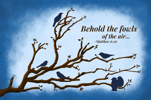
I liked the border much better, and the blue was closer, but still not quite there. Plus Jason had experimented with the tree to make it a little more 3-D rather than a flat silhouette, and I really liked that effect.
I think it may have been at this point that Jason used credits he had at Photobarn to print it off so we could see how the color might change from his iPad to the printing stage. His reasoning was that if it still didn’t come out right, he could sell the printed one while he worked on revising the one on his iPad to his mom’s (hopefully not too) exacting tastes.
One issue with the blue was that this picture would be hanging between two curtains that were kind of a slate blue. It took me years to decide on and then finally make those curtains, along with some matching pillows, so I didn’t want to just toss them. Plus, that’s my favorite shade of blue anyway.
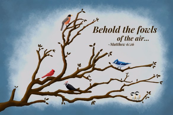
So while Jason was working on the blue, I suggested that maybe since the tree was not just a silhouette any more, maybe he could do something similar with the birds. I don’t think I have the picture of that one, but he tried some light and shadow on them. Then he tried making a couple of them look like actual birds and asked me what I thought. I loved them! So we talked about what birds we commonly saw at our feeders, and he came up with this:
Nice! Then I suggested that maybe the leaves should be green rather than brown, since we had moved from the silhouette to a more realistic looking picture. I can’t find the draft he sent me then, but I felt the green that was used was brighter than I liked, and, because of that, drew attention to the leaves. So I suggested darkening or toning them down a bit or maybe even adding some pink flowers. And then we were discussing that there were as many birds as there were members of our family minus one. I forget which one of us came up with adding a hummingbird to represent Timothy.
Up to the very last minute I toyed with the idea of changing the verse to a newer version, which says “Look at the birds…” rather than “Behold the fowls.” But, besides not wanting to introduce yet another change, I felt that people might recognize this as Biblical language, and if they were familiar with the rest of the passage, it would naturally come to mind. If they just saw “Look at the birds” and missed the reference, they might just look at the birds but miss the larger point.
So, with all the changes, this was the end result:
I can’t tell you how much I love it! It blends with the curtains well (although it might not look like it in this photo), it fills the space well, the colors and style are just what I like. And it was made by my very patient son. 🙂 And I got my pink flowers in that room after all. 🙂
I told him at one point that I would have gone through this same process even if I was doing it myself. It seems to take me getting into a project and starting it to think through and decide what I really want. I like to take my time with home decorating decisions because I don’t like changing them often: I want to think thoroughly about all the aspects and end up with an item that I am going to love and keep around for a long time to come.
I am not sure how long, in all, it took to complete this, from the first concept through the thinking, deciding, and changes, on top of his working full time and being a husband and dad. At least a year, maybe two or even more. But I think all the changes were worth it. I love the result, and I am so thankful to have this special piece. Thank you, Jason! ♥
(All art work here is under copyright by Jason Harper.)
I thought I’d share with you some of the recent cards I made as well as a hot-off-the press craft.
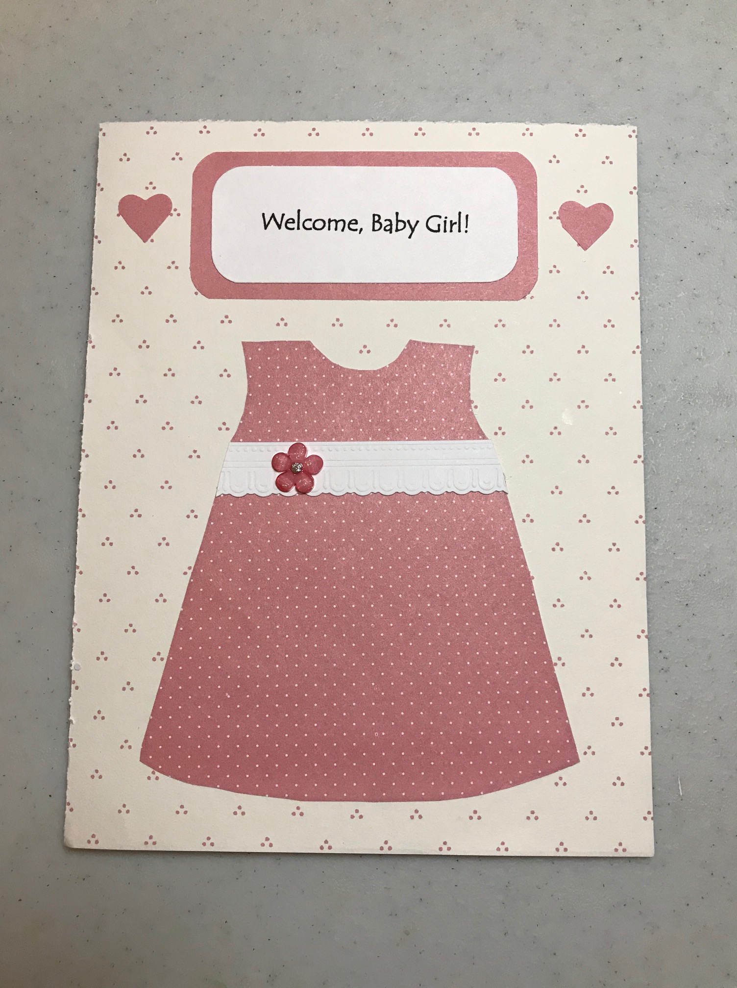
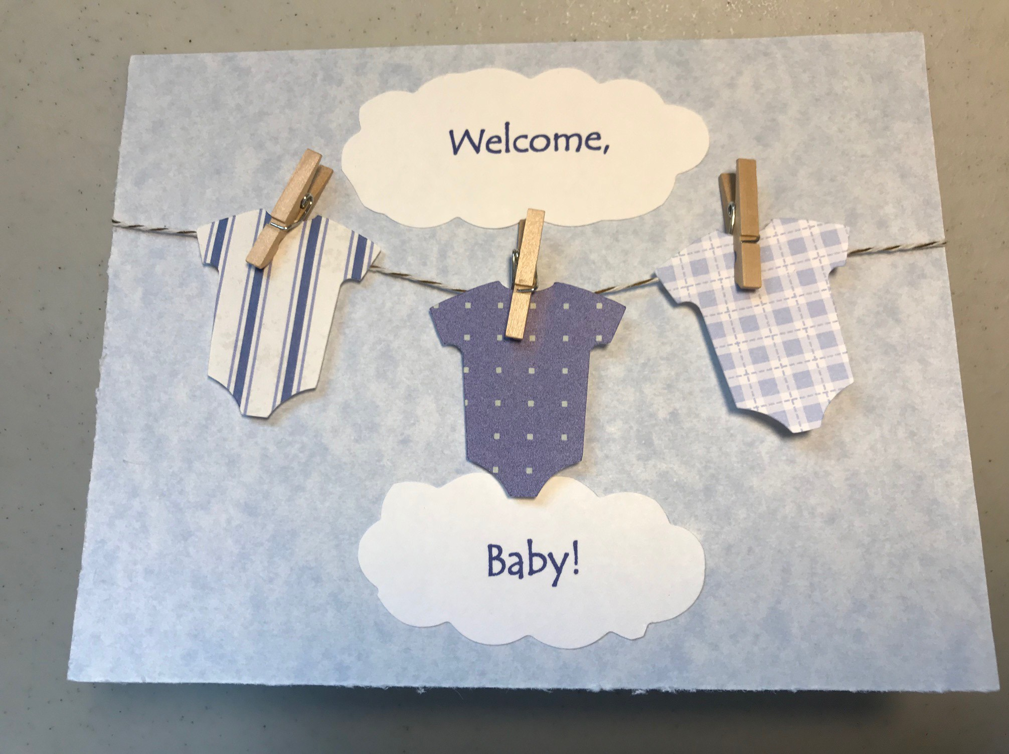
This was for a baby shower for a couple at church:
I had seen several ideas similar to this on Pinterest. The “onesies” were made with the Cricut machine. I learned you can make a reasonable looking cloud by cutting an oval or circle with scalloped scissors. I was a little afraid the twine would come loose, but I kept the card propped open on my table for a couple of days, and everything stayed put.
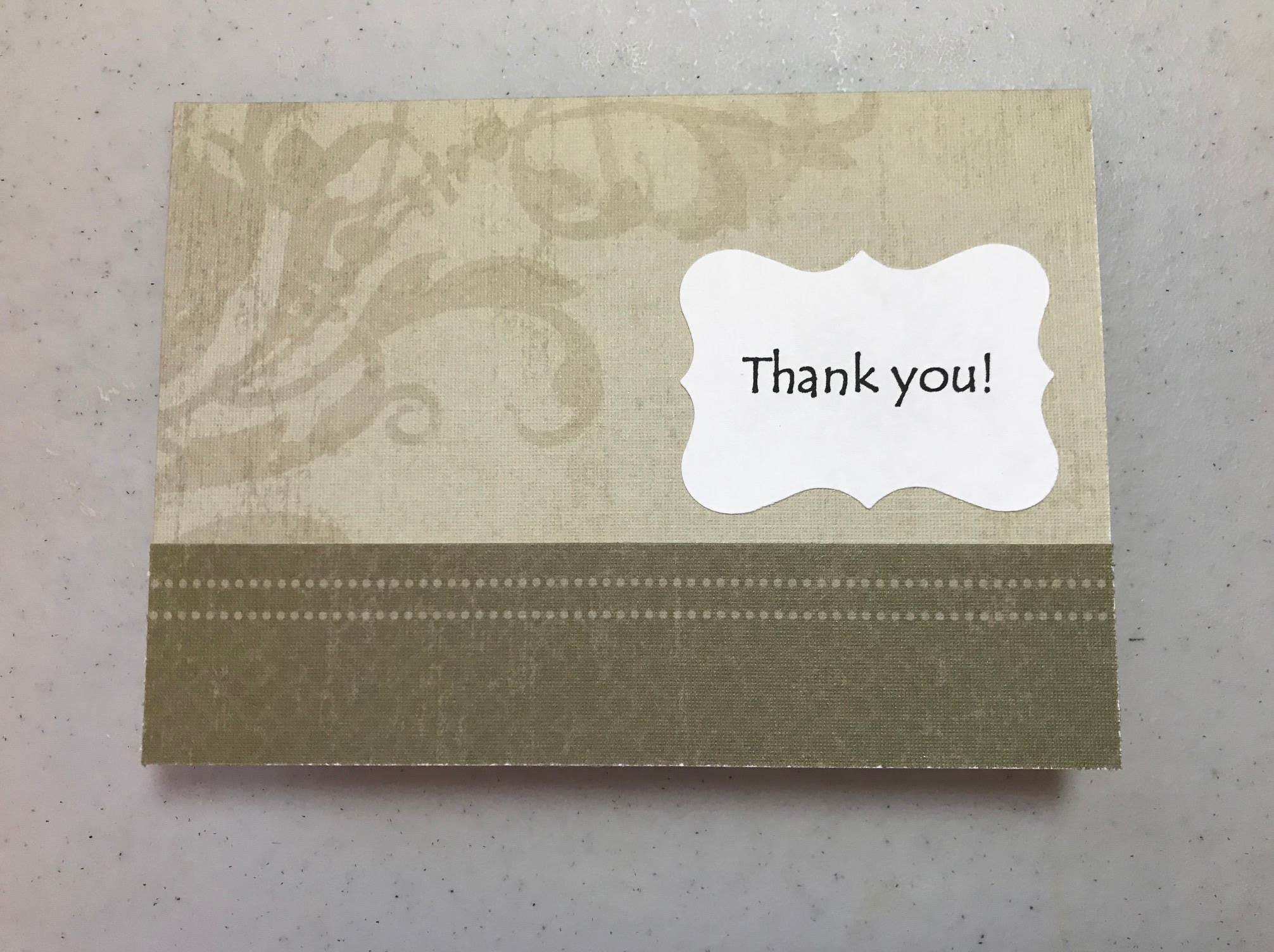
This was a thank-you card for a friend:
This was another instance where the paper itself was so pretty and had enough detail that adding much else would have been superfluous.
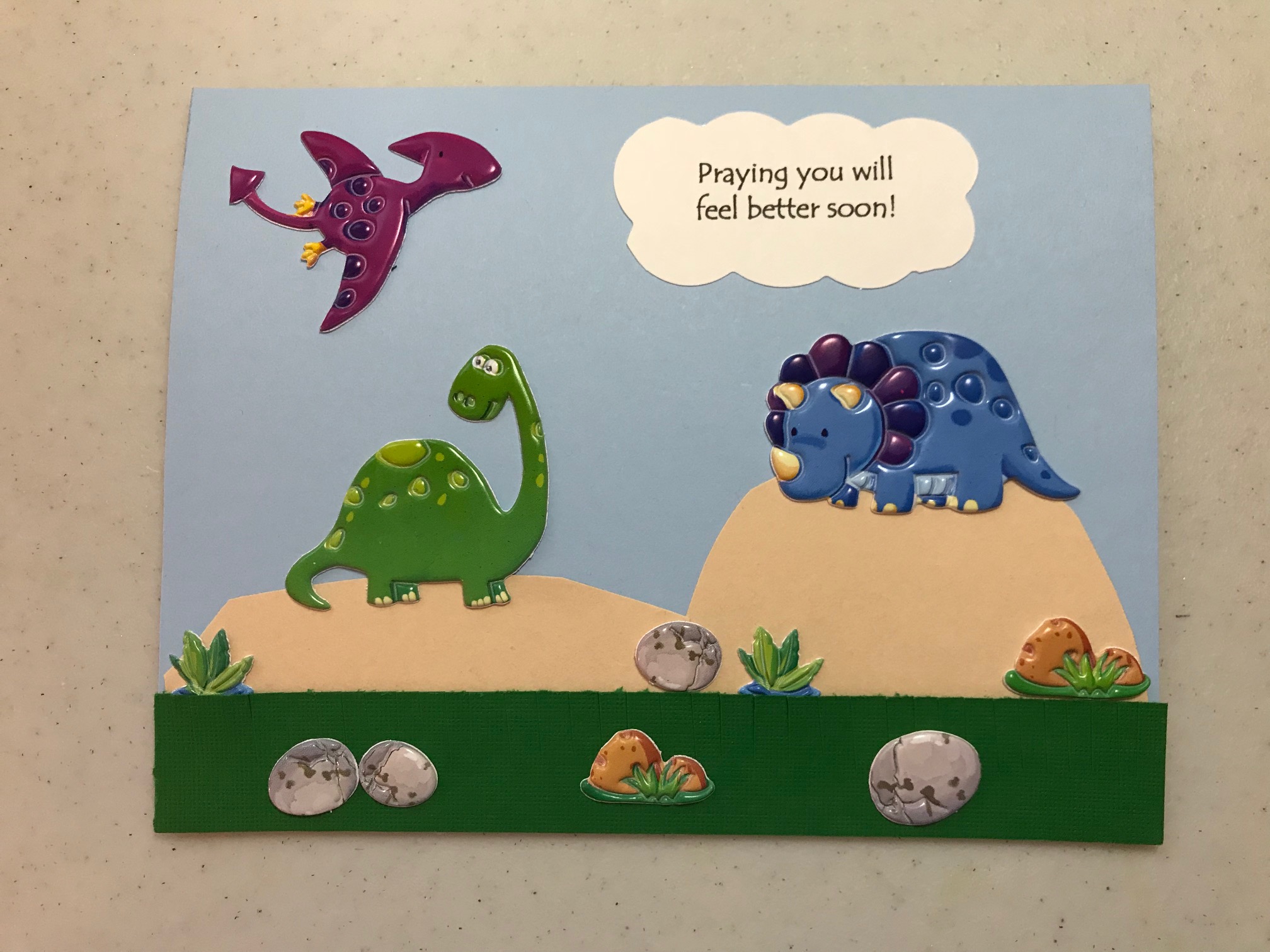
This was for a little boy in our church recovering from surgery:
I asked someone who knew the family well if there was an animal or character he particularly liked, and they mentioned dinosaurs. None of the dinosaur shapes on the Cricut looked like what I wanted, so I used puffy stickers. I cut the grass and hills free hand and snipped across the strip of grass to make it look a little more 3-D. then I tucked a couple more packages of dinosaur stickers inside for him to play with.
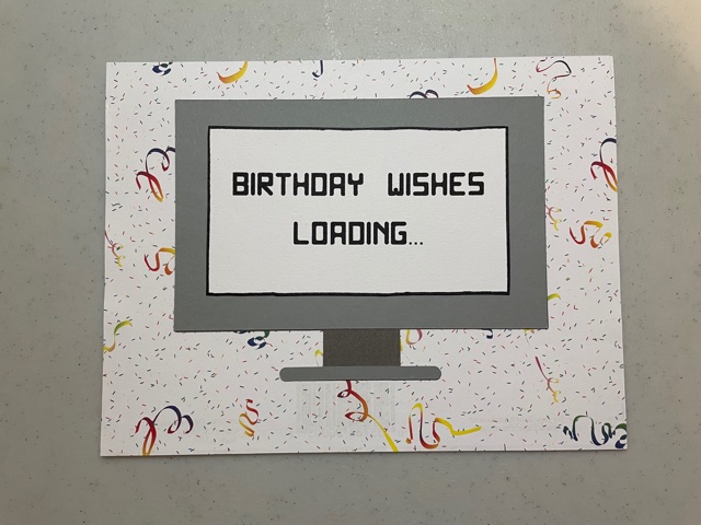
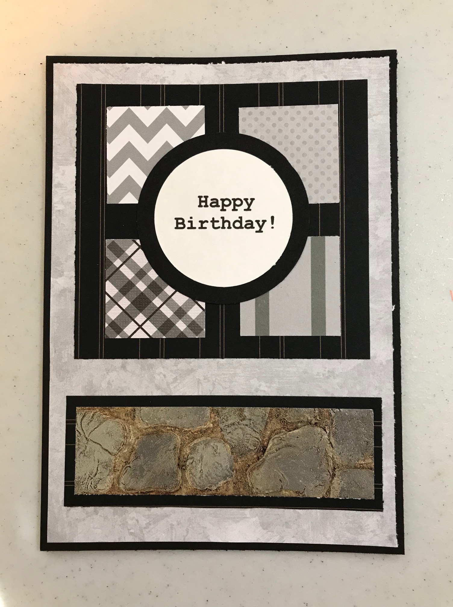
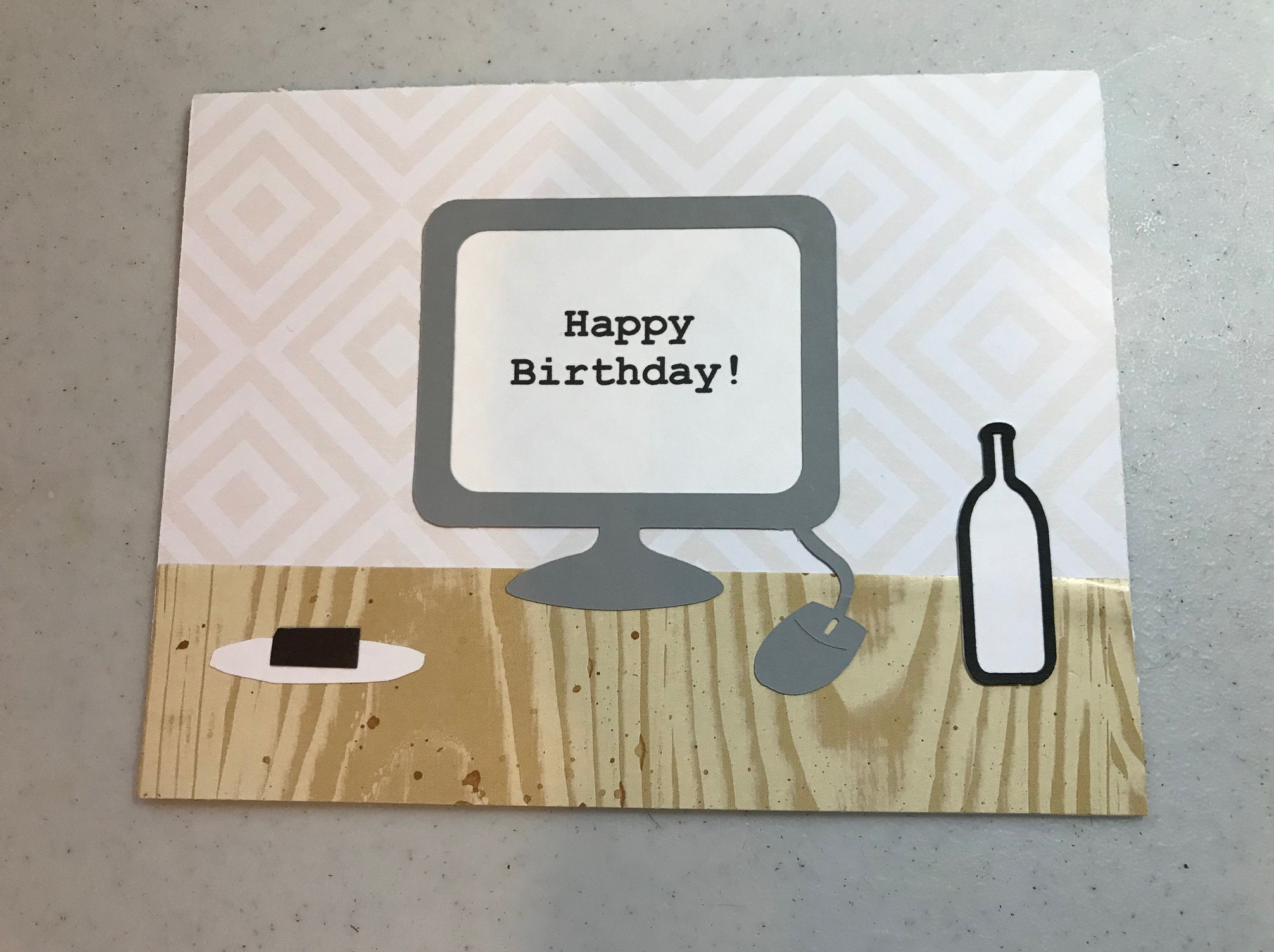
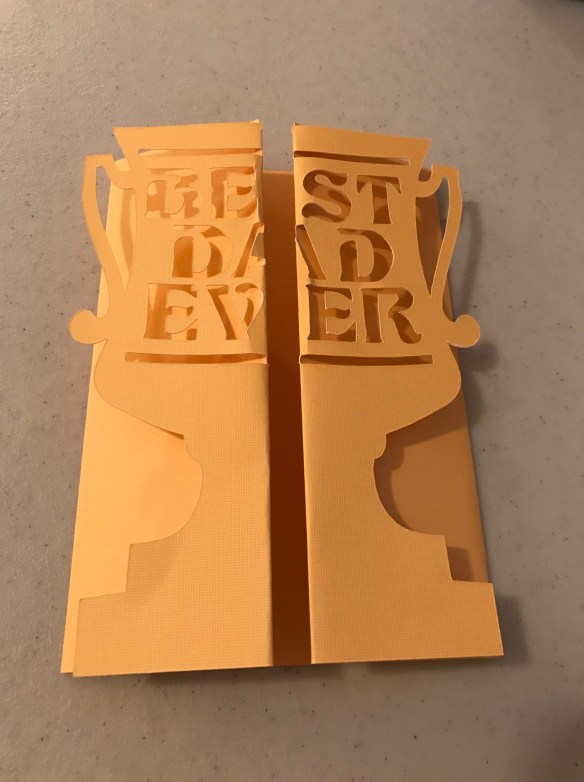
This was for Jesse’s birthday:
He is very much into computers – his work, his major, his classes, and his hobbies all revolve around the computer. So I wanted to reflect that. The computer shape was done on the Cricut, and the desk was a scrap of wood-grained paper I had on hand. I liked it better before I added the “snacks,” so I should have left well enough alone. But they also reflect him accurately. 🙂 The bottle was done with the Cricut and was supposed to look like the type of flavored water he drinks. The plate and brownie I did free-hand.
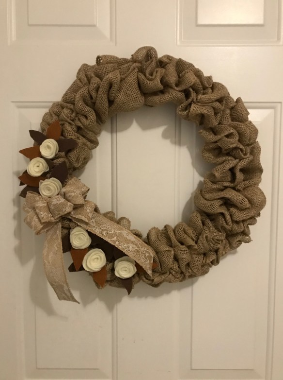
When I put out my autumn decorations, I realized there was a door I had no wreath for. And we can’t have that, can we? 🙂 Somehow I must have misplaced one, because I remember having a scarecrow one in addition to the one near the front door. Anyway, I remembered I had the same thought about needing another wreath last year, and even bought supplies for a burlap wreath, but didn’t get around to it then. So I found them in my craft room closet and worked on it bit by bit. It didn’t take all that long, but I had to work it into odd bits of time. I found a plethora of burlap wreath ideas on Pinterest. I found instructions for the burlap part here, and a helpful video tutorial here. The felt roses came from a site I had used before for them here. This is a much simpler way to make felt roses than many tutorials I’ve seen that tell you to cut multiple petals and sew them all together. I used a hot glue gun instead of stitches. I was really pleased with how it turned out!
I cut the leaves freehand out of felt and glued everything on with hot glue. I learned to do the bow when I worked part time for a florist friend in early married days.
True confessions: I didn’t realize until I got the burlap part all done that I hadn’t gotten the burlap loops even in length all around. So I put the flowers and bow on the place the difference was the most noticeable. Also, a couple of times while pushing the burlap through the wreath form, my thumb accidentally poked a hole in the burlap. But thankfully the loose weave that enabled the hole also enabled fixing it by just moving the threads around.
I’m trying to decide whether to put an initial or something on the other side. But for now I like it as is.
It felt really good to get some creative projects done!
My WIP (work in progress) has over 29,000 words now! Yay! I’ve written most of what was in my mind. Now I am going through notes I left to myself on my phone to remind me of points I wanted to add. Then I need to go through a list of posts and a stack on books that I wanted to reference. Then I need to take a look at each individual chapter and see what shaping-up I need to do. This is all a bit more tedious, but very necessary. I am still mulling over some of the same writing questions I mentioned a month or so ago, but I think I am about ready to create an author Facebook page. It seems like that should wait til I am finished or even published, but I am told publishers want that kind of thing established beforehand.
Cards
As many of you know, I like to make cards as a creative outlet. It has been a while since I shared them, so here’s what I have made since last time I showed them.
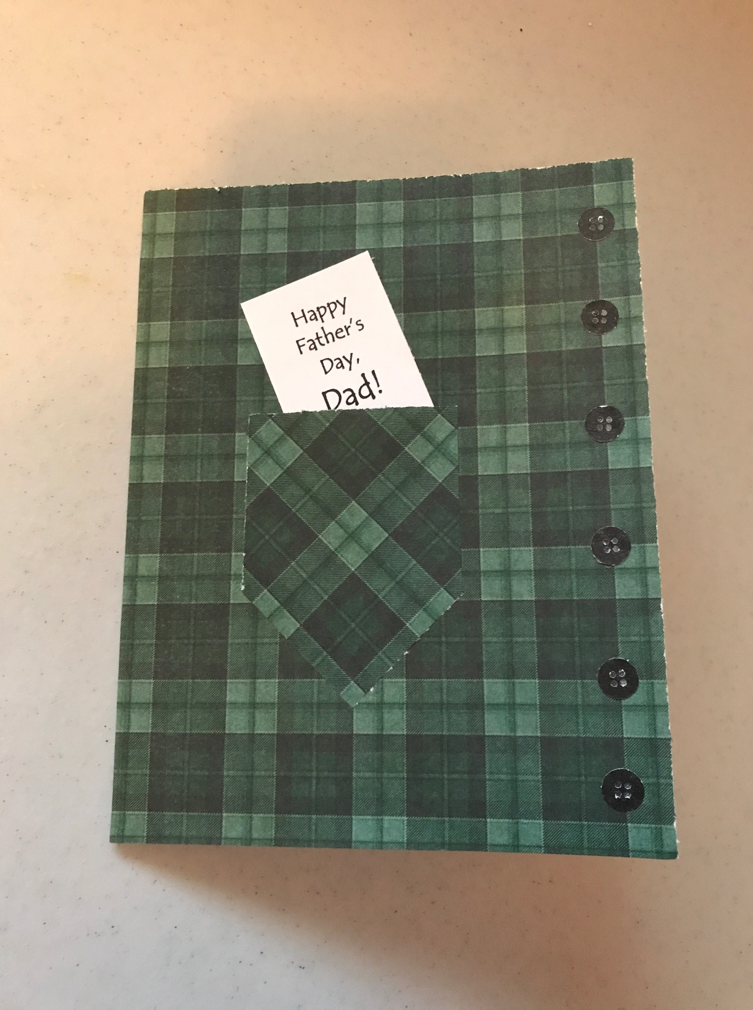
This was my Father’s Day card for Jim, done on the Cricut.
This was for Jason for Father’s Day, also cut on the Cricut machine. As Timothy’s into super-heroes, I thought this would fit. 🙂
I forgot to take a picture of my step-father’s card.
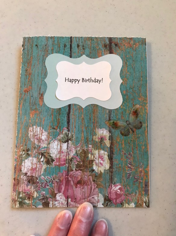
This was for a friend’s birthday. The paper was so pretty in itself, I didn’t want to cover it up with a lot of other things.
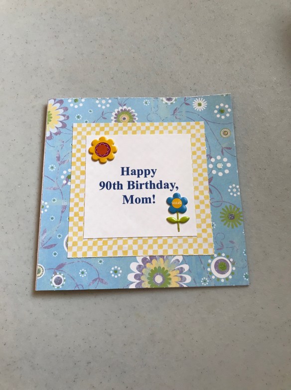
This was for Jim’s mom’s 90th birthday. She likes yellow.
This was for Jason’s birthday last month. Technically the design is not a birthday one, but when I saw it on the Cricut design space, I *had* to use it. I also learned a new skill with this one: changing out the blade for a Cricut pen, which does the lettering.
Movies
I mentioned yesterday the books I’ve read the past month. We don’t watch many movies – Jim prefers shorter programs. But we’ve seen a few over the last several months. The Book Thief was excellent, set during WWII about a girl sent to live with foster parents in Germany who then hide a young Jewish man in their basement. Wonder, about a deformed boy trying to go to school for the first time, was really good, too, with several touching moments and a lot of fun ones. The Finest Hours was based on a true story about the largest small boat rescue ever. A tanker was ripped in half during a storm, and four men in a small boat brought back 32 survivors (the boat was only supposed to hold 20 or so). Warning: there were a couple of bad words at the beginning. But otherwise this was excellent. I especially liked watching the main character’s growth.
My first podcasts
Lisa would be so proud of me! She mentions several good-sounding podcasts every month, but usually I listen to either music or audiobooks. But recently I listened to several in regard to the recent PBS adaptation of Little Women. It was fun hearing some of the background and views from some of the actors.
Recent Conversations
For July 4th, my son and daughter-in-law brought over some themed plates that someone had given them. When we asked Timothy what the plates reminded him of, with their red and white stripes and white stars on a blue background, he said, “Captain America!”
One day I spilled my lunch down my front and lamented, “I’ve been feeding myself for over 50 years, and I still keep spilling!” Jim said, “It’s only going to get worse.”
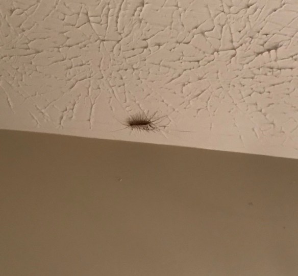
One day I found this on my bathroom ceiling:
I called Jim to come and take care of it for me. He said, “It’s ugly.”
We’ve had a pretty quiet, routine summer so far. Lots of fun times together with the family. Later this month my oldest son comes for a visit, and Jim will take some time off then. We usually have a few outings the week Jeremy is here. It will be nice to have some extended family time and a bit of a “stay-cation.”
Better get back to work now. Thanks for visiting and chatting with me!
I thought I’d share some of the cards I’ve made recently.
This was for a friend.
The wording was made with a stamp. I don’t remember where I got the stamp, but I love it.
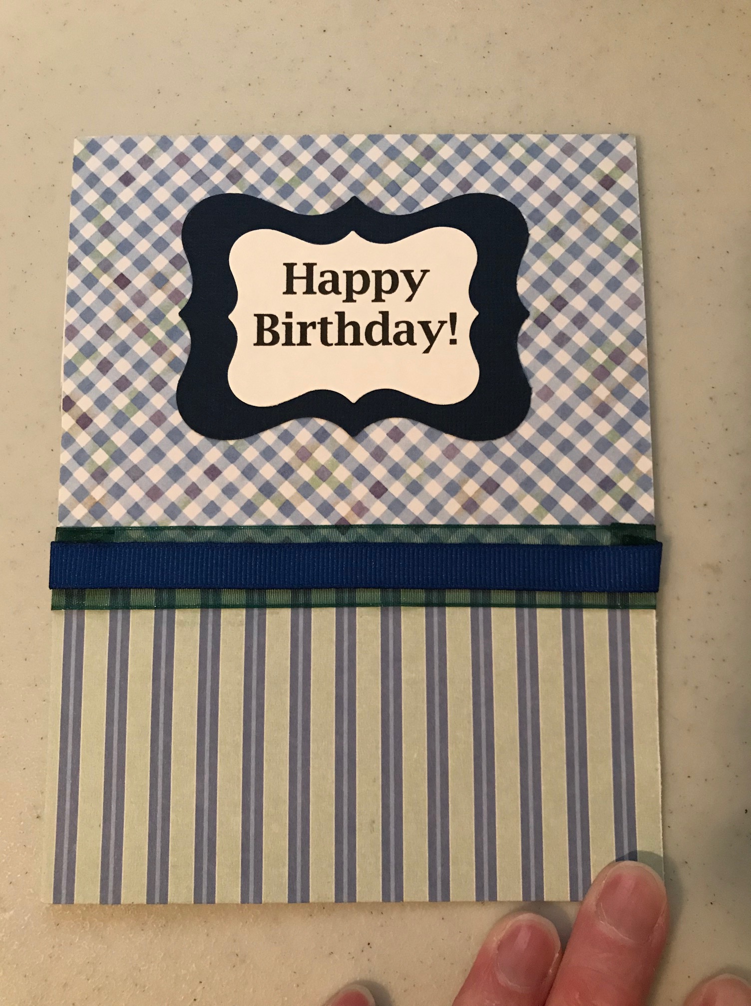
This one was for Jim’s birthday in March.
The wording was done on the computer and it and the background shapes were made with two different sized punches.
This was for Timothy’s birthday:
Since these are licensed characters (PJ Masks, for those of you unfamiliar with preschooler TV heroes. 🙂 They provided the theme for his birthday this year), I wanted to be careful not to just copy images from the Internet. I searched for free PJ Mask printables and found these as cupcake toppers, then printed and cut the figures out for the card.
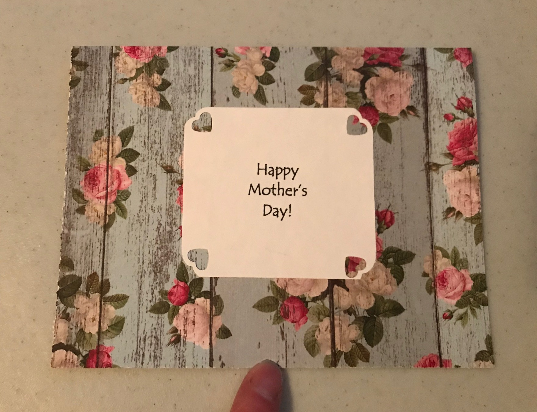
The rest are for Mother’s Day. This one was for a sweet lady I’ve looked up to as an adopted spiritual mom since my college days.
The paper was so pretty and detailed, I wanted to keep any added decorations simple.
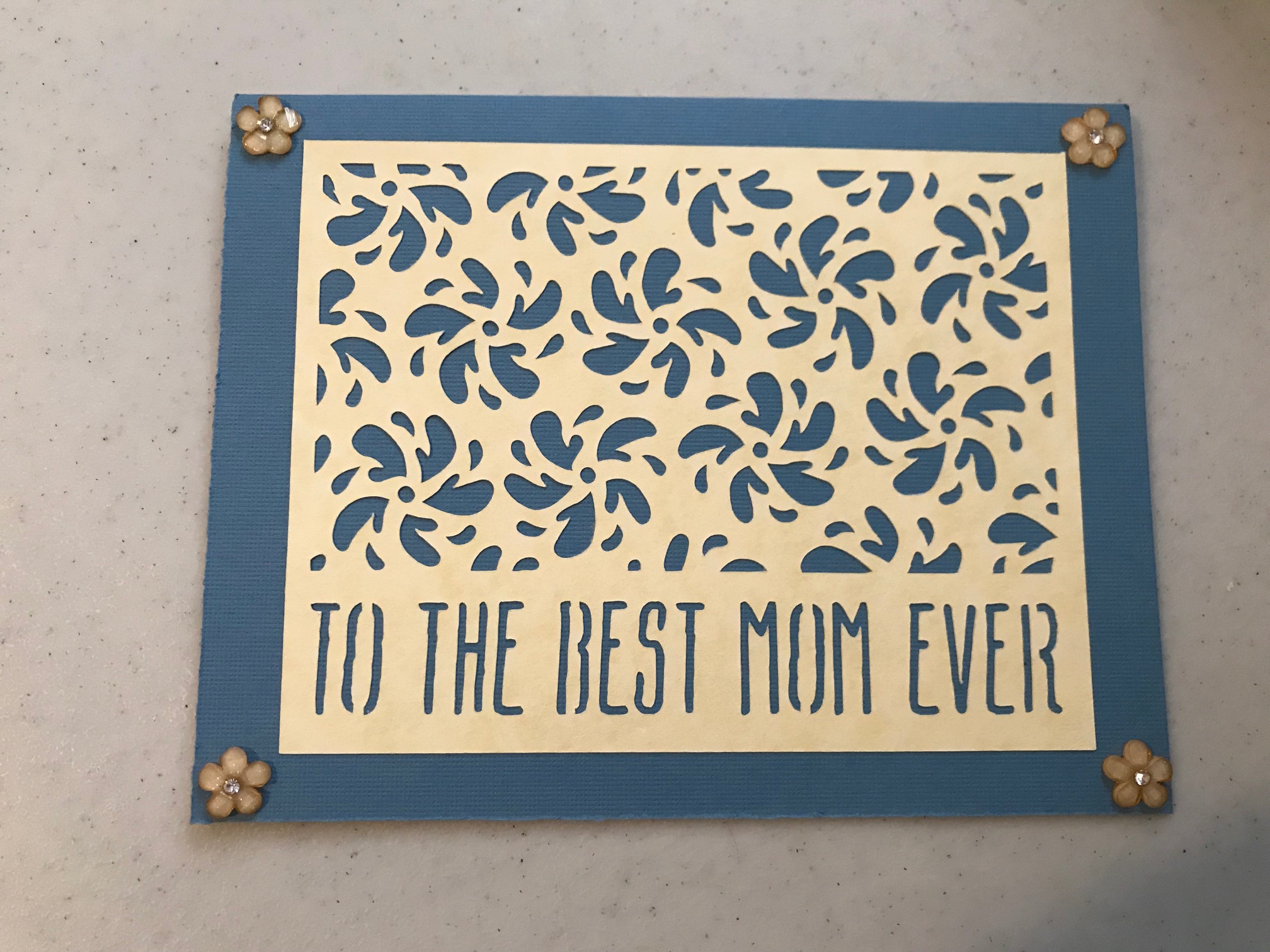
This was for a friend, and I ended up using the same basic idea, but on a square card.
This was for my mother-in-law:
The design was done on the Cricut, but was a little smaller than the card, so I filled in the corners with these stick-on 3-D flowers.
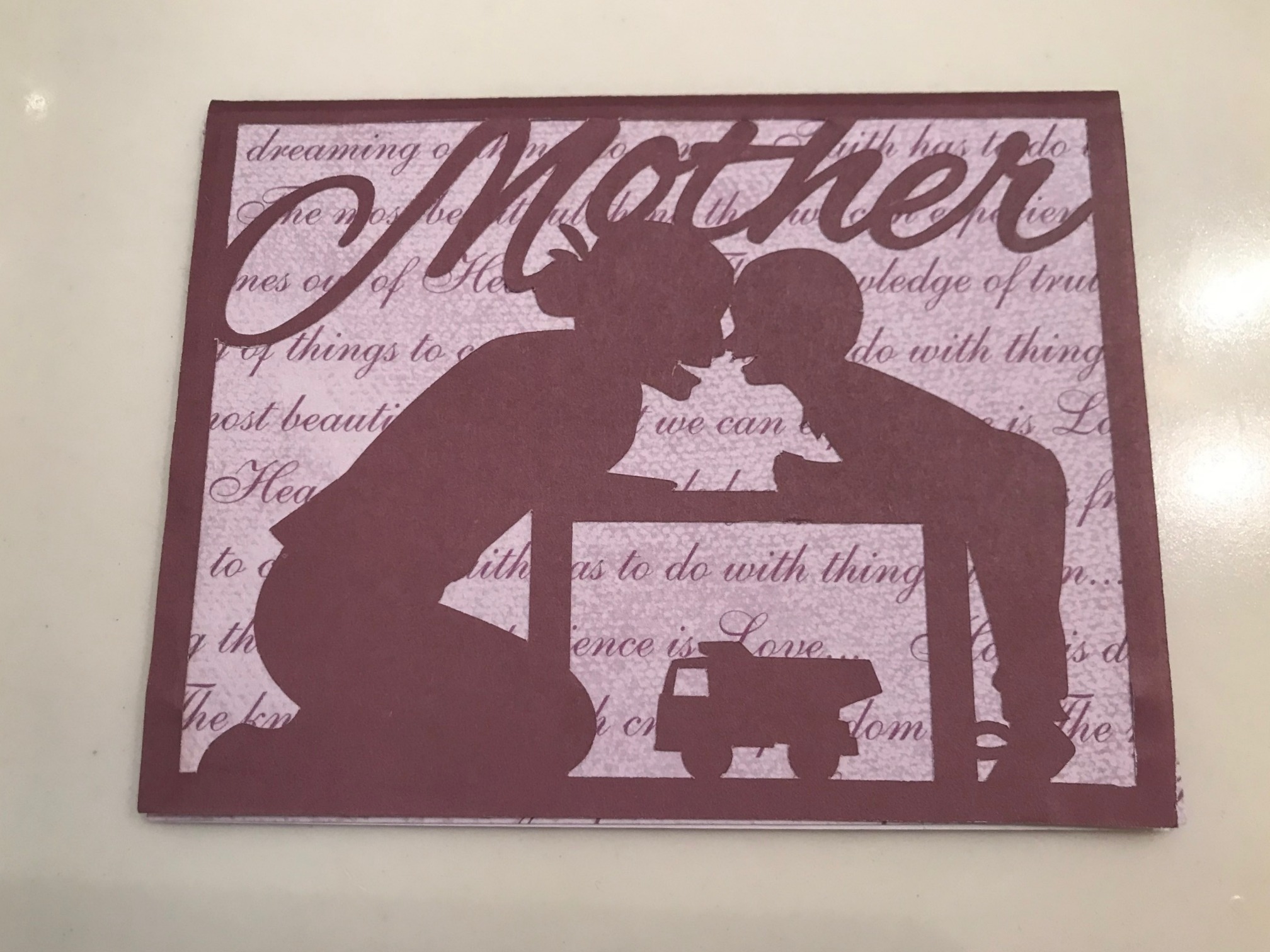
And this is one of my favorites, for my daughter-in-law:
This just looked like her and Timothy! This design was on the Cricut also, so all I had to do was choose the design and papers, push the right buttons to cut them out, and then glue it all together.
You can tell I am not a professional, with not-the-best lighting and my fingers in some of the photos to hold the cards down. But I make them as an expression of love to the recipients and for fun and a creative outlet as well.
None of my heart punches was big enough for the size I needed for the heart cut-out, so I traced a stencil on the back to cut out with an Xacto knife. But I forgot that, since it was on the back, I needed to tilt it the opposite direction from what I wanted it to be on the front. So trying to write the initials the right direction was really confusing – I guess that must be the way left-handed people feel about much of the right-handed world. In fact, after a number of tries, I ended up tilting the paper with the initials on it to line up with the direction of the heart, resulting in the “grain” of the wood print underneath to run diagonally instead of vertically. But don’t tell anyone – maybe they won’t notice. 🙂
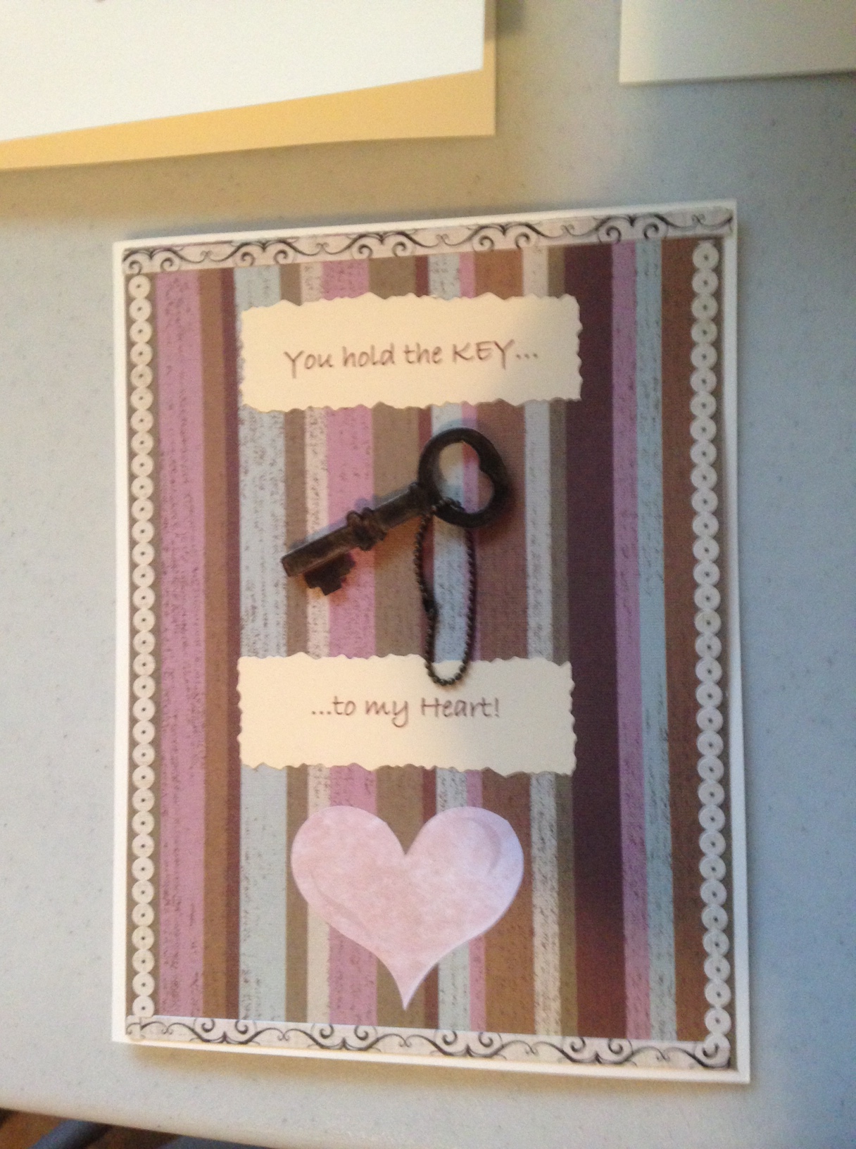
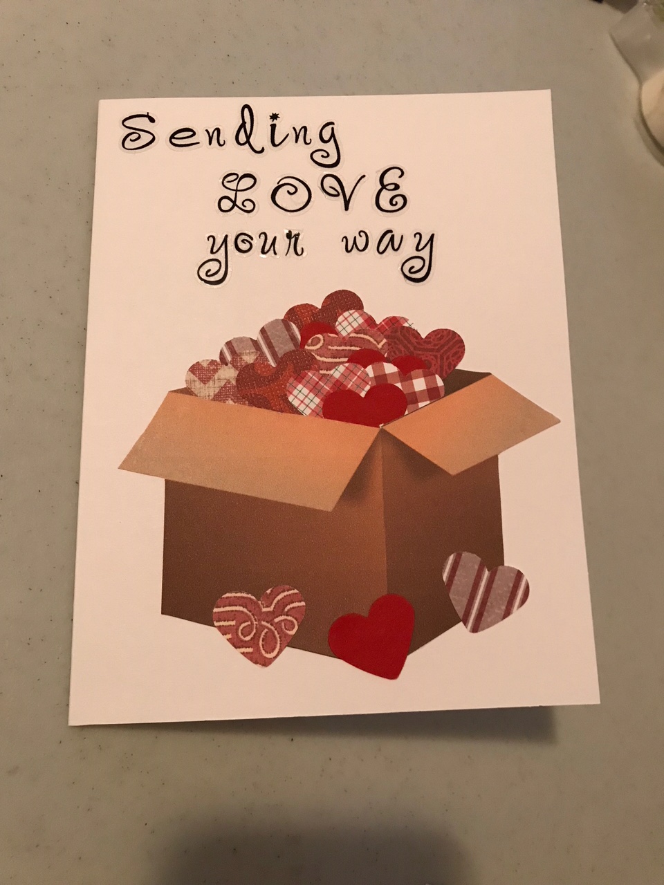
This was for my oldest son, apt since he lives in another state:
This was also spurred from a Pinterest find. To take you behind the scenes a bit, when I clicked through to the web site from which it came, I read that the box came from a stamp. I didn’t want to buy a stamp for a one-time usage and didn’t know if I could find one anyway, so first I tried to draw one. That didn’t go so well. 🙂
So I thought I’d look for a clip-art box online that I could trace around, and then it dawned on me that I could print off a clip-art box and then just cut it out (duh!). So I did that and used an Xacto knife to open a slit to put the little hearts into. The hearts were made with a heart punch and several scraps of red paper. The letters were stickers, which I ended up not being too crazy about because the sticker wasn’t just the letter: it included a little plastic around the letter, and when the light hits it just right, you can see all the plastic. But I did like the script and the way it came out overall.
I just noticed the title there said this was from designs “for her,” but I thought this was masculine-looking and used it for that reason! I found a world map online, printed it out, and used a stencil to make the heart shape.
This was for Mittu. She likes purple, so I looked through my purple papers until I came up with an idea. The design was embossed with a Cuttlebug folder, one I don’t think I had used yet.
The wording on all of these except Jeremy’s was done on the computer, and I used scrapbooking scissors to make the edge on this one.
This was Timothy’s:
You can tell who he likes. 🙂 This idea was also from Pinterest. I found the cityscape on the Cricut and cut it out there. I found the Batman logo online and finagled the ray of light myself. I was going to put “Have a SUPER Valentine’s Day” in the light, like the example did, but the space ended up being small, so I just put a heart there and wished him a “super-duper” Valentine’s Day inside – apt not only for the superhero logo but also because he says “super-duper” sometimes.
This was Jesse’s:
I found this design on the Cricut Design Space and and used the Cricut to cut it out, so it was pretty easy. And this was good for him – conveying the thought without being mushy. 🙂
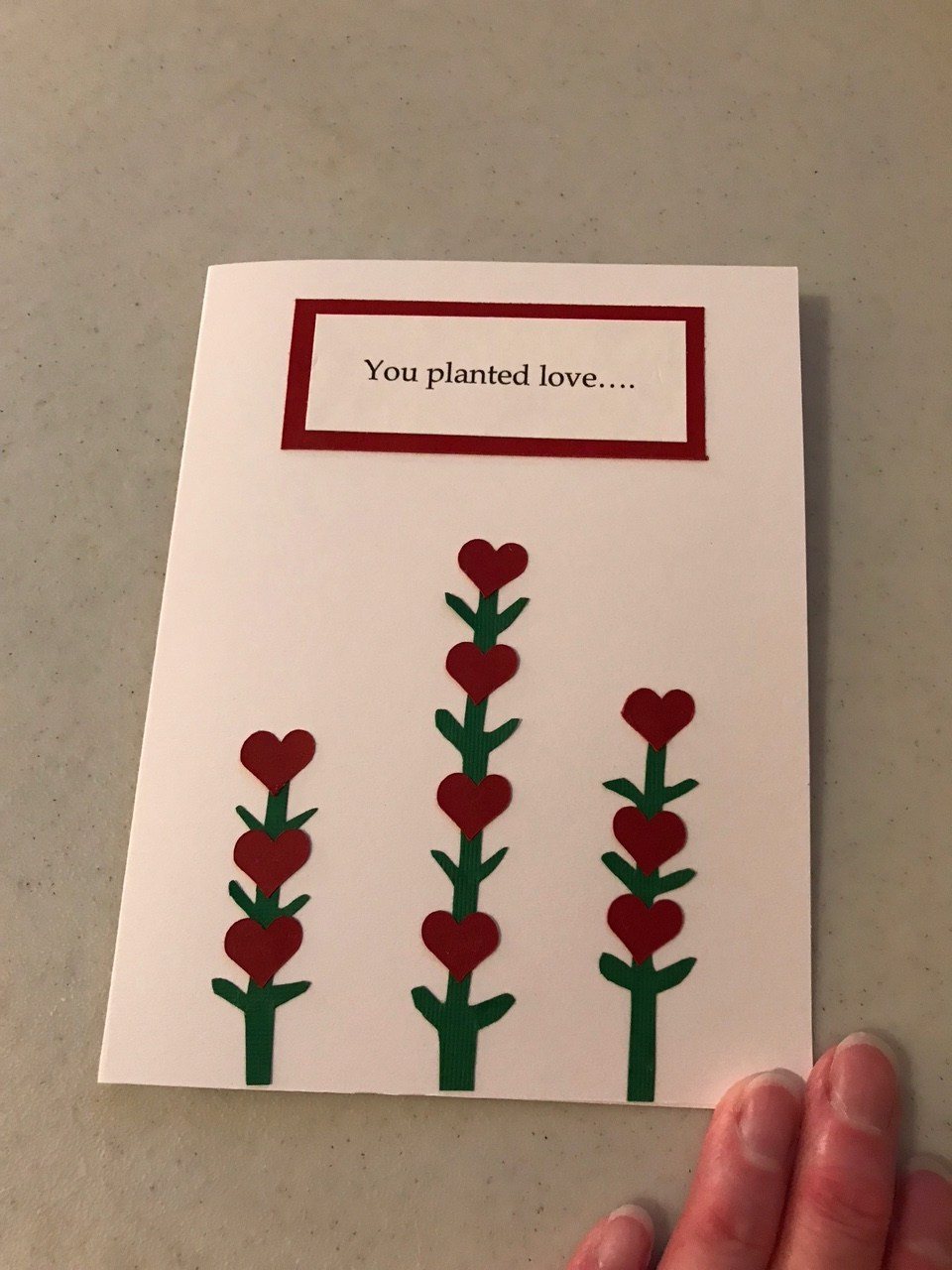
This one I was going to throw away, but I ended up not having time to make another one. It was from this idea and was going to be for my husband. Though it looks cute there, my version ended up looking childish, so I put it aside and went with the other idea I had for him above. As I worked on the other cards, I thought perhaps I could rework this for my mother-in-law and decided to use that idea if I didn’t have time to come up with something else. As it turned out, I didn’t have time – somehow I miscalculated and thought I had another week before Valentine’s Day, and then it hit me I think on Sunday that Valentine’s Day was THAT week. So I had to do all the cards between Monday and Wednesday. I changed the sentiment to “You planted love…” on the outside, and inside, “…and grew a family,” and went on to say that her love started it all for the rest of us. I liked the thought but still didn’t like the design itself – primarily the stems. I had tried to cut them out freehand and that just didn’t work very well.
Then we celebrated my daughter-in-law’s birthday recently, and I made this card for her:
Once again I looked through my purplish papers for inspiration, and when I started to use this one, I decided to keep the design simple since the paper itself was so pretty and had a lot of design in it. The wording and mat underneath were done with two different-sized punches.
The hard time I have with making cards for Mittu is that, since she’s the only daughter-in-law in the family so far, I have all these feminine ideas pinned and have a hard time narrowing down which one to use! And then I ended up not using any of my pinned ideas at all for her cards. But I liked how they turned out.
So, that’s it for this time – not perfect or professional, but heartfelt. 🙂
Today is the first “back to the old routine” day in a while. I love all the holiday activities, and God was kind to grant me some pockets of quietness and rest amid the busyness. Getting out of the normal routine for several weeks was fun and refreshing. Getting back into it feels both good and sad at the same time. We had a wonderful Christmas with all the family home and then a very quiet but enjoyable New Year’s Eve and Day.
I thought I’d show you the Christmas cards I made for the family. I buy boxes of them for extended family and friends – I’d never be able to make as many as I send out – but for our own family I like to make individual ones.
This is Jim’s:
It doesn’t show up in the photo, but the white words are flocked. If I had been thinking, I would have cut off the bottom pine cone so more of the word Noel showed up.
This is Jeremy’s:
Sometimes ideas come from others I’ve saved on Pinterest, sometimes from something in the Cricut design space, and sometimes they come as a result of looking over the materials I have. This one started out with the fox sticker, as Jeremy likes foxes, and then the other elements came one by one. This is one of my favorite cards I’ve ever made.
This is Jason’s:
I had wanted to use blue because he likes blue, and I had also wanted to use the snowflake embossing folder on one, so those came together here.
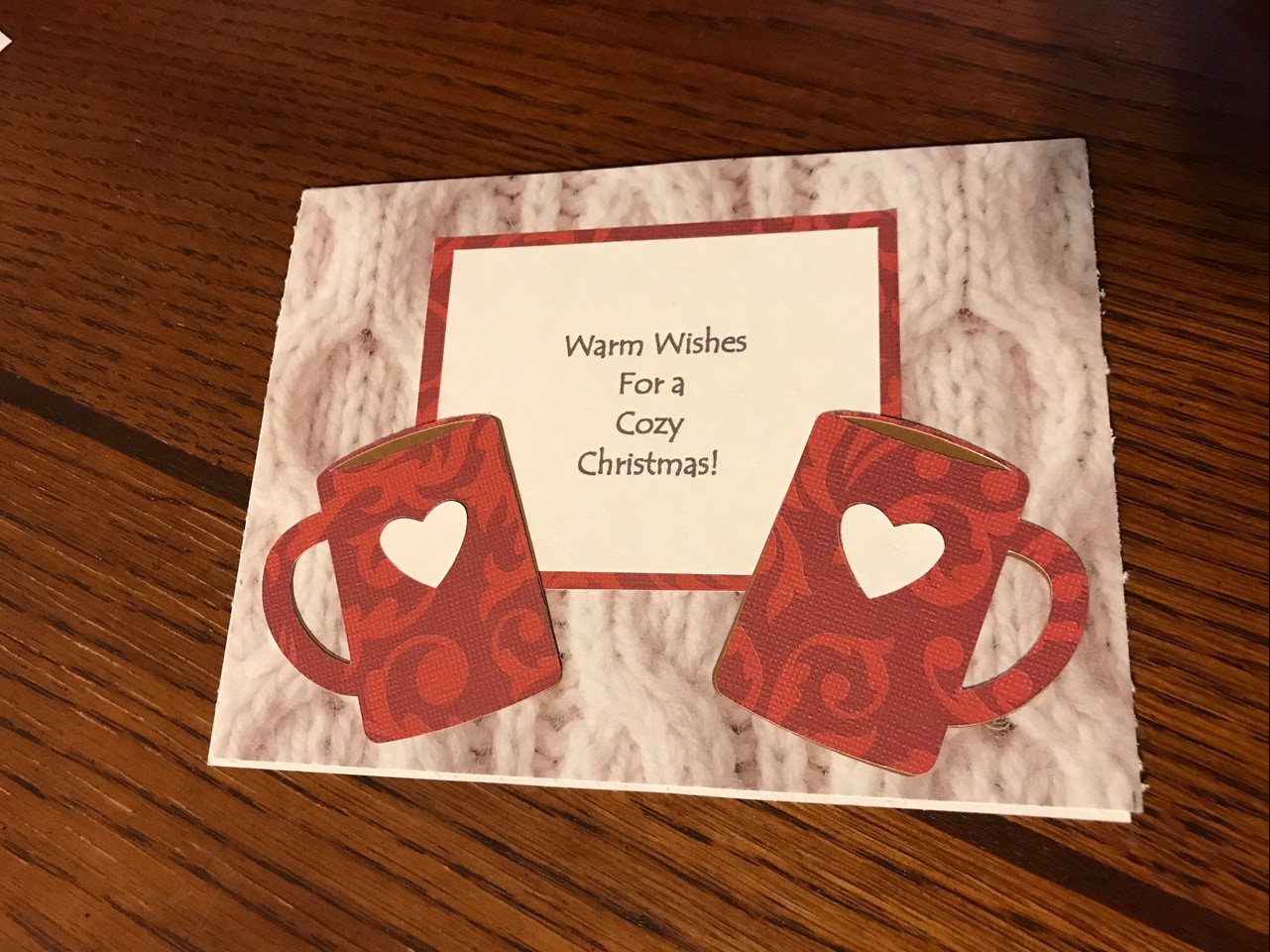
This is Mittu’s:
I love that cozy sweater background paper, and they love coffee, so these seemed like a good pairing. The cups were done with the Cricut.
This is Jesse’s:
This started with the word sticker – that just seemed to fit him. Everything on the white part is a sticker.
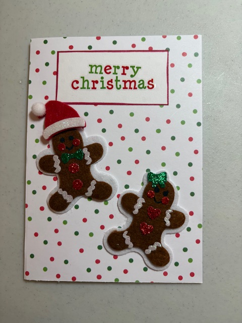
This is Timothy’s:
I had seen the cookies on a cookie sheet idea on Pinterest, but the shapes on it were three of the same gingerbread men. As I looked through my scrapbook paper, I found one with these gingerbread figures on them, so I cut them out. Thankfully I had enough of a scrap of the metallic paper for the cookie sheet. 🙂
This is Jim’s mom’s:
And this was for Jim for our anniversary:
Other stray thoughts this morning:
We had turned on the TV New Year’s Eve long enough to see the ball drop, and I commented that I always wondered how they did bathroom issues in Times Square during that event. I envisioned a long row of port-a-potties somewhere. Jeremy looked it up and said there are no port-a-potties – and businesses don’t let the crowds come in to use the restrooms. And some people are there as early as 8 in the morning! They also don’t allow backpacks or large bags, don’t allow people to sit down, and they kick out the food stands to make more room for people. I looked up a couple more articles this morning (here and here). I never had aspirations to go to this anyway, but it’s definitely on my “Nope, I don’t think I’ll ever do this” list – which is guess is the opposite of a bucket list. 🙂
I’ve rediscovered cheese and crackers as a snack. My mom used to always send Swiss Colony cheese and sausage packages for Christmas until the kids all got older and it got too expensive to send them. But usually one of us gets a Hickory Farms package at some point during the Christmas season. This year we opened it on Christmas Eve. Then I had mentioned earlier that somehow we got started having the Chicken in a Biskit and Easy Cheese during the holidays, so I have enjoyed munching on them all month. They may not be the healthiest snack, though – especially the Easy Cheese – so I probably need to find a better salty snack.
One of the things I miss most about putting Christmas decorations away is the lights. But not enough to keep any up year-round.
I’ve also enjoyed several weeks of Christmas music. I got a new Christmas CD this year, Worship the Newborn King from the Wilds Christian camp. I especially loved the Candlelight Carol. I’ve loved that for years but rarely hear it. Other long time favorites have been their Christmas With Friends album (although that doesn’t seem to be available any more) and Sacred Music Services’ King of Glory. I also like some of Pentatonix – not the more raucous stuff, but I especially like their versions of Silent Night, The First Noel, Carol of the Bells, Dance of the Sugar Plum Fairy, Mary Did You Know, and others in that vein.
I don’t make resolutions per se, but I do like to make reading plans for the year and map out some projects I want to work on, so I hope to do that this week. I like to incorporate some purposefulness in my reading but with some flexibility in case I come across something new I want to read during the year. I hope to have my reading plans posted in the next day or two.
Also this time of year you see a lot of people writing about words for the year. I’m not sure how that got started. A lot of people derive great blessing from it, and that’s great. Personally I have never felt led to do so. Usually God has more than one word to work on in my life at any given time. 🙂 But can I say, if you feel stressed about choosing a word for the year or guilty because you don’t have one, don’t worry about it. Seek God about it, and if you sense His leading toward one area of concentration, then go for it, but if not, just seek Him in His Word and seek His will every day.
This is also a good time of year to find a good Bible reading plan if you haven’t already. I wrote on that extensively here. There are all kinds available. Probably the best plan is one you’ll actually use. Reading the Bible through in a year is a good thing for several reasons. A Christian radio station I listen to reads through the Bible throughout the year during daily 15 minute segments, not really too difficult for anyone. The last few years I have continued to read the complete Bible, but not in a year. I am not sure how long it takes me. I aim for a couple of chapters a day, but vary it according the the length, difficulty, or density of the passage I am in and whether I want to stop and slow down in certain passages.
And now I had best get on to some of that daily routine that needs attending to. Thanks for visiting. 🙂
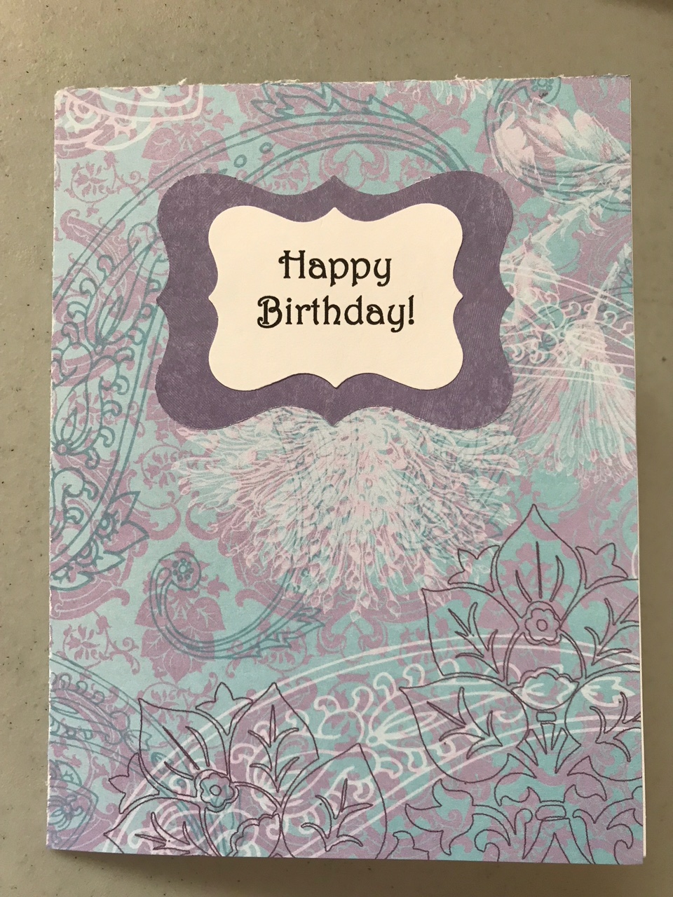
I thought I’d show you the cards I made for this last Father’s Day.
This was for my step-father, adapted from an idea seen on Pinterest.
I love that it’s simple but still makes for a nice design. The buttons were made on the Cricut machine. I toyed with using real buttons and thread, but I was afraid they might fall off in transit.
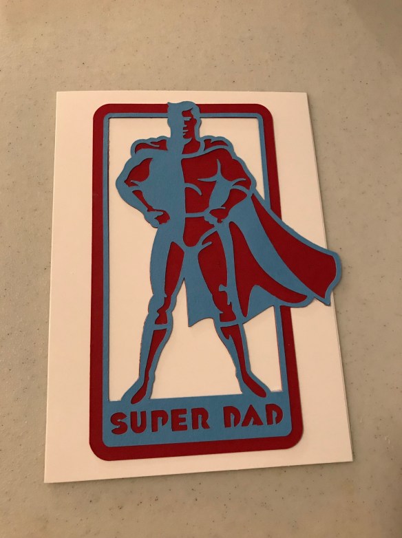
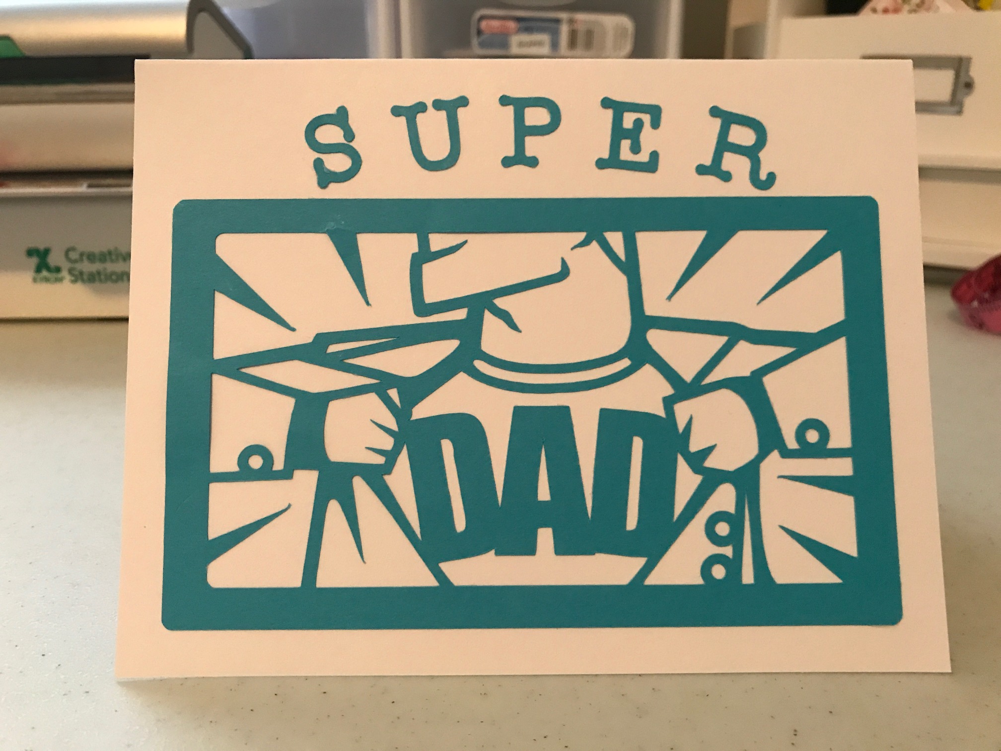
This was for my son. My grandson likes super-heroes, so I thought it was fitting for a super-dad. 🙂
This was from one of the Cricut Design Space’s “Make It and Take It” cards, but I tweaked it a bit from what they had – they didn’t have the “Super” at the top, and their whole card was the size of the blue frame.
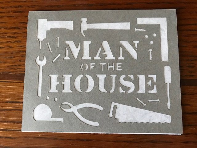
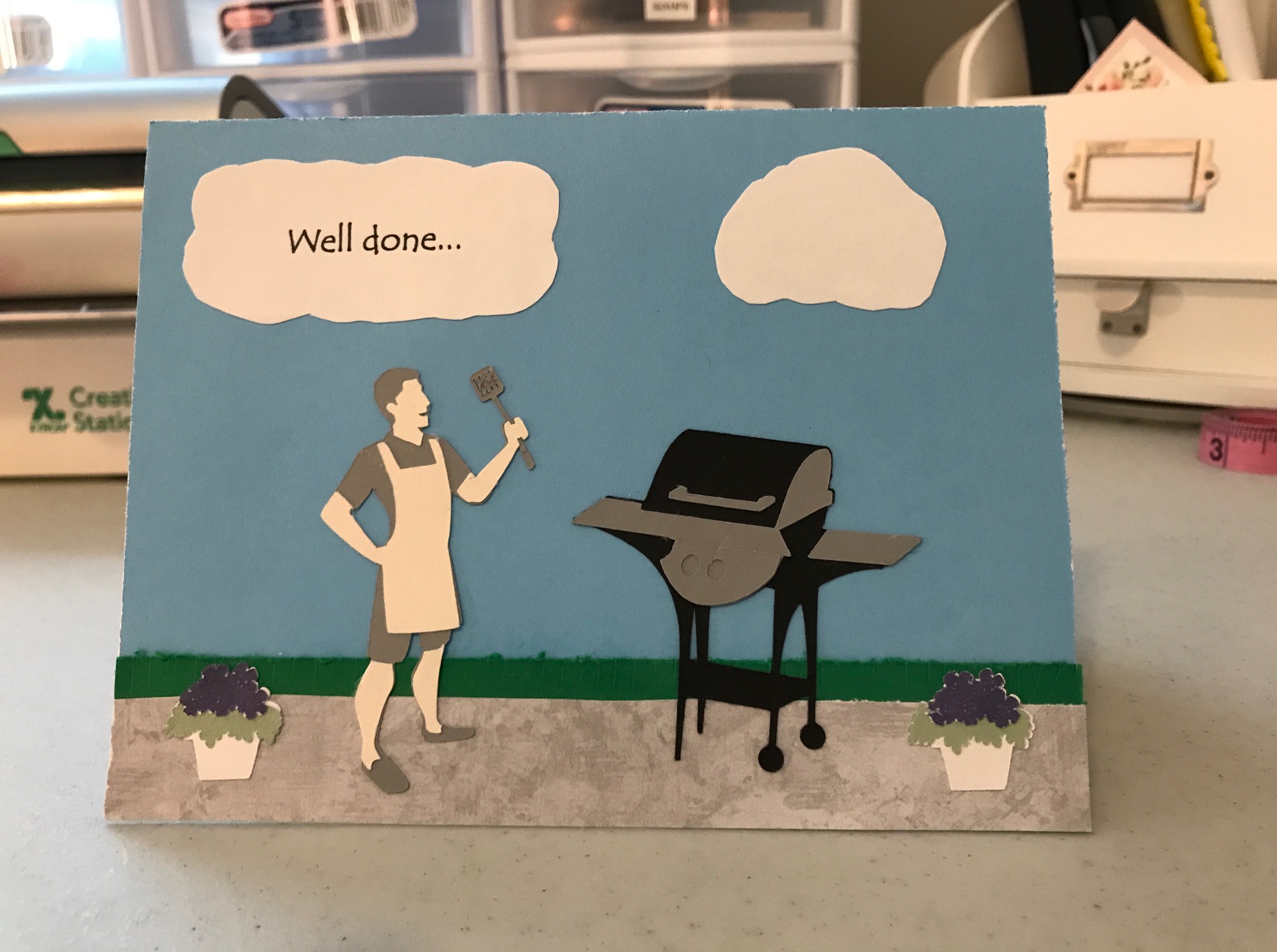
For my husband, I wanted something to do with grilling, so I searched the Cricut Design Space’s files for “grill.” Both this grill and the little man showed up, so I used both of them. The design kind of evolved as I worked. I cut little snippets with scissors in the “grass” so it would look like grass blades. I started to stick the figures in the grass, but we grill on our patio, so I used the textured-looking grey paper for the patio. I was going to put “Well done” at the top (a play on the idea of well-done food and well-done fathering), then decided I would put that in a cloud. I had everything centered in the middle but thought the cloud looked odd centered right over the figures as if it was about to rain on them. So I moved it to the side and added another for balance, cutting them both out freehand (I had typed the “Well Done” and printed it on cardstock, along with the inside sentiments of the cards). Then the bottom corners looked like they needed something, so I looked up flowerpots. This flower design actually had a couple of other layers on the flowers and leaves, but they were so tiny they didn’t come out well. I decided the flowers looked ok as is.
That was it for this time. I think everyone liked their cards. 🙂